


Each program has its advantages. SQL is very fast to answer questions on data. It is quite useful to pull fast insights, especially if you can directly write code to the database, i.e. in your ERM system. But it is not that good for reporting. When you need to do calculations on the results and present them in special formats, there are much stronger tools like Excel and Power BI.
Excel is among the most powerful tools to prepare your bespoke reports. One of its many uses is to perform specific calculations, report the results in desired outlay. If you need to report the percentage of the sales to customers from European countries to Total Sales, you can do this with one formula in a cell in Excel.
Last week we analysed the Lead Merchants sales database with SQL. SQL is efficient if you need standard reports like in the sales table. Each column has its unique content; each item of the same category can be under the corresponding column content in all rows.
Mostly we prepare reports like a Balance Sheet with the ageing breakdown, so it starts with the row ‘cash’ all amount is in ‘on-demand’ column, then the row ‘fixed assets’ for useful life broken down into years in columns. Then the row ‘receivables’ is broken down into ‘due’, ‘due in 2 weeks’, ‘1 month’, ‘3 months’, ‘1 year’ in the report columns. In such cases, the tool we want to use for reporting in Excel.
In this part of the workshop, we will first start with typical features of Excel and in the second part we will go on with the power features.
Analysis with Formulas and Pivot Tables
In classic Excel, there are a few different ways you can reach the desired outcome; using formulas, features like sort, filter, subtotals and pivot tables. We will do all in the first part, preparing an Excel report and a dashboard. My experience is that using only formulas is the best way to prepare and automate bespoke reports.
Excel is among the most powerful tools for bespoke reporting and analysis. But it comes with a few bottlenecks: there is a limit to the data you can load and analyse at one shot, which is around 1 million lines (1.048.576 rows to be exact), and it also has performance problems. Even if your data is much less than a million lines when you work on complicated reports such as the balance sheet ageing report, Excel gets slower and slower, at times it can be frustrating.
Lead Merchants database has 5 tables with orders table consisting of 2 million rows of data. There are still ways to work with that data in classic Excel but to prevent time loss and frustration we pulled summary data from SQL. It is the flat file we prepared in SQL, which means all tables of the database are combined in one big table, and data is summarised in a way that it has the least number of rows, which will allow us to do our analysis. For me, this was the best use of SQL for a long time, summarising the data to work in Excel; then came the power features.
The flat file we got from SQL has 229.560 rows of data + 1 header row. 2 million lines are summarised to around 1/7 of the original size. The summary could be done a few different ways; for our purpose, we think that monthly reporting figures would be enough for our analysis, reporting on daily figures was not necessary. We took out the day information, summarised the data for each month; meaning if a customer bought a product more than one time in a given month this data is decreased to one line, keeping all the column information the same but only aggregating the numeric figures such as total units sold. If the customer bought another product in the same month, this is another line.
If we needed the weekly figures, the summary data would be much bigger. If we needed the daily figures summarising over dates would not be possible.
Below are the summary data file and Excel workbook used in the analysis. For the complete database and related files follow the link.
Now let’s start our analysis. We will start with the Report, then the Pivot and finally the Dashboard.
The Report
There are a lot of ways to pull insights from data in Excel. Especially to answer our simple questions, pivot tables are the fastest and most efficient way. We will anyway start with formulas because this is the real power of Excel for bespoke reporting.
Now open the ‘LM_SQL_to_Excel_Flat_File.csv’ in Excel and save it as .xlsx file. Create a sheet and name it ‘report’.
In the report sheet, we start with the questions.
1. Monthly sales totals of Lead Merchants (units sold, revenue, profit)
2. Report regional sales figures (units sold, revenue, profit)
3. Sales by product (units sold, revenue, profit)
4. List top 10 countries by revenue
5. Customer profitability: top 100 customers by profit
6. Employee performance: report top 5 employees who made the highest profits
There are good practices working with a large amount of data in Excel. An important one of them is parsing the data by naming its columns and referring these columns with their names in formulas. A good practice for naming is to start with a _ for each name and put short but easy to keep in mind names to each column. Select all data in the column you want to name and write the name in the name box. For customer names, we chose column C cells 2 to 229.561 and input name ‘_CUNA’ or find a better name that suits you and press enter.


Our names are:
| Column | Names | Reference |
| month | _MO | =LM_SQL_to_Excel_Flat_File!$A$2:$A$229561 |
| customer_id | _CU | =LM_SQL_to_Excel_Flat_File!$B$2:$B$229561 |
| customer_name | _CUNA | =LM_SQL_to_Excel_Flat_File!$C$2:$C$229561 |
| product_category | _PCAT | =LM_SQL_to_Excel_Flat_File!$D$2:$D$229561 |
| product_id | _PID | =LM_SQL_to_Excel_Flat_File!$E$2:$E$229561 |
| product | _PN | =LM_SQL_to_Excel_Flat_File!$F$2:$F$229561 |
| country | _CN | =LM_SQL_to_Excel_Flat_File!$G$2:$G$229561 |
| country_id | _CNID | =LM_SQL_to_Excel_Flat_File!$H$2:$H$229561 |
| region | _RE | =LM_SQL_to_Excel_Flat_File!$I$2:$I$229561 |
| region_id | _REID | =LM_SQL_to_Excel_Flat_File!$J$2:$J$229561 |
| employee_id | _EID | =LM_SQL_to_Excel_Flat_File!$K$2:$K$229561 |
| employee_name | _ENA | =LM_SQL_to_Excel_Flat_File!$L$2:$L$229561 |
| total_sales | _SU | =LM_SQL_to_Excel_Flat_File!$M$2:$M$229561 |
| revenue | _SR | =LM_SQL_to_Excel_Flat_File!$N$2:$N$229561 |
| _cost | _SC | =LM_SQL_to_Excel_Flat_File!$O$2:$O$229561 |
| stock | _ST | =LM_SQL_to_Excel_Flat_File!$P$2:$P$229561 |
You can view, add or edit names in name manager:


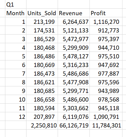
Q1. Monthly sales totals of Lead Merchants (units sold, revenue, profit)
We create a table on cells B2 to E14. Name the row cells B2 to E2 as Month, Units_Sold, Revenue, Profit. Name the column cells B2 to B14 from 1 to 12 representing months.
There are a lot of ways that you can create these formulas. I prefer good old array formulas.
Formula –
Cell C3=SUM((_MO=B3)*_SU)
Cell D3=SUM((_MO=B3)*_SR)
Cell E3{ =SUM((_MO=B3)*(_SR-_SC))} – The curly brackets in the last formula
are the old way of entering array formulas, which is not necessary anymore.
Press shift+ctrl+enter (CSE) to enter the array formula.
Select cells C3 to E3 and copy until/including C14 to E14.
Finally, enter SUM to get subtotals at cells C15 to E15.

Q2. Report regional sales figures (units sold, revenue, profit)
We will create a table from cells G2 to J9 to present region figures.
Name row 2 as Regions, Units_Sold, Revenue, Profit and column G as the name of the regions.
Now how do we find the list of the regions (or products, customers, countries, employees for other questions)? We do not have a separate file for each of these like we had in SQL, and we have to pull them from the huge flat file.
There are a few ways, but luckily Microsoft released new array formulas in September 2019, which makes life a lot easier in such cases.
Find the list of regions
Formula –
Cell V3=UNIQUE(_RE) – this is a new array formula, it spills over the cells
below and gives a list of unique values in the referenced name _RE, regions
column of the flat table (currently unique function works only Excel 365
version, download the file without UNIQUE function below).

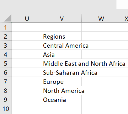
Note that we only entered the formula to Cell V3 and it spilt over to Cell V9 and populated the whole list. Examine these cells; in V3 there is the formula we enter, and we can delete and edit it. In other cells, there are the spilt formulas in shaded grey, which means you can neither delete nor edit them. They are dependent on the formula entered in cell V3.
Now follow the procedure we did in Q1; copy the region names to cells J3 to J9, enter the below formulas to cells from H3 to J3 and copy these formulas up to cells H9 to J9 and take subtotals.
Formula –
Cell H3 =SUM((_RE=G3)*_SU)
Cell I3 =SUM((_RE=G3)*_SR)
Cell J3 =SUM((_RE=G3)*(_SR-_SC))


Q3. Sales by product (units sold, revenue, profit)
Formula –
Cell Y3=UNIQUE(_PN) - A list of all products
Create a table from cells L2 to O27 and apply the same procedure in the previous question with the below formulas to present product figures
Formula –
Cell M3 =SUM((_PN=L3)*_SU)
Cell N3 =SUM((_PN=L3)*_SR)
Cell O3 =SUM((_PN=L3)*(_SR-_SC))


Q4. List top 10 countries by revenue
Formula –
Cell AB3=UNIQUE(_CN) - A list of all countries
Step 1-
Create a table from cells G13 to J198 and apply the same procedure in the previous question with the below formulas to present country figures
Formula –
Cell H14 =SUM((_CN=G14)*_SU)
Cell I14 =SUM((_CN=G14)*_SR)
Cell J14 =SUM((_CN=G14)*(_SR-_SC))
Step 2-
Now we have a list of 185 countries, and we only have to report the top 10 by revenue. The best way to achieve this is a pivot table, but we are keen to do this with formulas at the report work.
Select the table (cells G13:J198), sort Z to A (largest to smallest) by revenue and delete the cells below row 23. Take totals to row 24 for countries table.

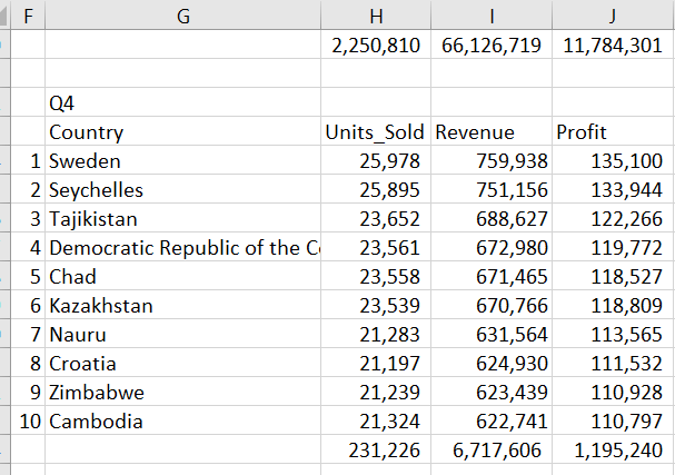
Note that we could set a filter to this table and filter the top 10 countries. But unlike pivot tables, the filter hides all contents in a row, not only filtered table, which is a problem when data from other tables or formulas exist in the same row.
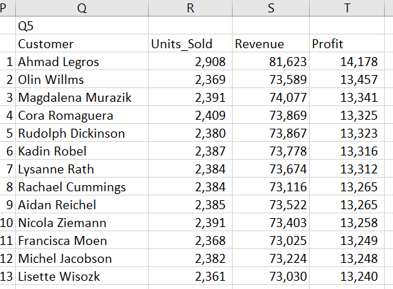
Q5. Customer profitability: top 100 customers by profit
Formula –
Cell AE3=UNIQUE(_CUNA)                  - A list of all customers (a magical
 954-row list pulled out from 229.561-row dataset by one simple formula)
Step 1-
Create a table from cells Q2 to T956 and apply the same procedure in the previous question with the below formulas to present customer figures
Formula –
Cell R3 =SUM((_CUNA=Q3)*_SU)
Cell S3 =SUM((_CUNA=Q3)*_SR)
Cell T3 =SUM((_CUNA=Q3)*(_SR-_SC))
Step 2-
Go on with the same procedure as with Q4 and delete after 100 customers.

Q6. Employee performance: report top 5 employees who made the highest profits
Formula –
Cell AH3 =UNIQUE(_ENA) - A list of all employees
Step 1-
Create a table from cells G27 to J48 and apply the same procedure in the previous question with the below formulas to present employee figures
Formula –
Cell H28 =SUM((_ENA=G28)*_SU)
Cell I28 =SUM((_ENA=G28)*_SR)
Cell J28 =SUM((_ENA=G28)*(_SR-_SC))
Step 2-
Go on with the same procedure as with Q4 and delete after 5 employees.


With the above tables, all questions are answered. The reporting in real life is much more complex than preparing these tables. To show the power of Excel on bespoke reporting and to give a flavour of Excel’s versatility in performing calculations and pulling valuable insights from data, we move forward with a second report sheet, Quarterly. This sheet shows quarterly results for each region, in comparison with full-year figures and allows analysis per product.
The quarterly report also presents a simple use of the new XLOOKUP formula. Follow the link to see an explanation of this sheet.
Next is the Pivot.
The Pivot
Although using the formulas are the best approach for reporting in Excel, with the kind of work we are doing pivot tables are the fastest and most convenient solution.
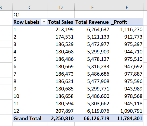
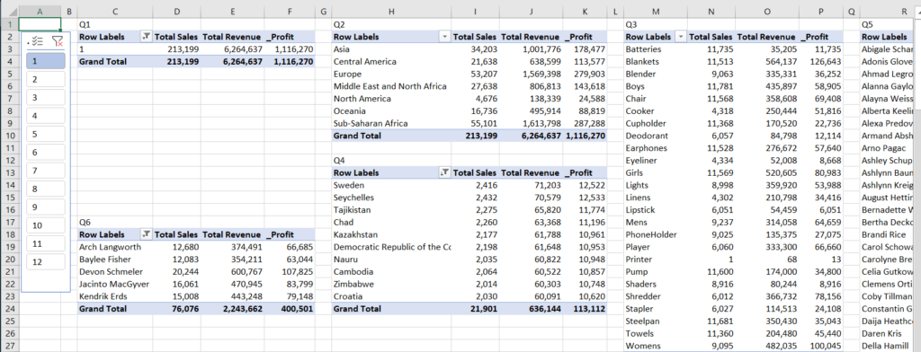
Q1. Monthly sales totals of Lead Merchants (units sold, revenue, profit)
Create a new sheet, name it Pivot.
Create a pivot table showing month on rows and units sold and revenue on columns from our data on sheet Pivot starting from cell C2. See how to create the pivot table.
On the pivot table, right-click on grand total and select value field settings. In this dialogue select number format and select number and comma as a separator with 0 decimals.


Do the same for the other grand total field. Now change the column names to Total Sales and Total Revenue.
We now have the monthly total units sold and revenue in our table. We can also add cost directly from our dataset, but the dataset does not have a profit column, for that we will add a calculated column to our pivot table.
From the PivotTable Analyze menu select the ‘Fields, Items, & Sets’ tab, select the Calculated Field from the drop-down list.

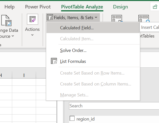
We create a field named Profit, which subtracts cost from revenue.

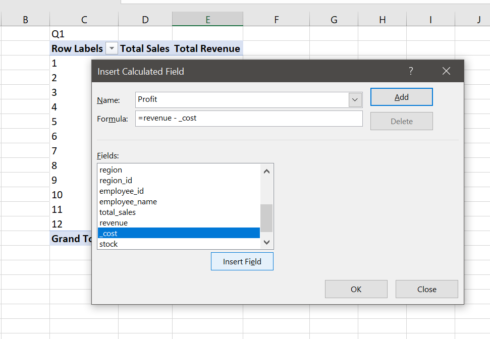
Finally, we change the name of the column we added as _Profit, and our first pivot table is ready.

One last thing, another good practice is to properly name the pivot tables, especially when you are working with more than one table.
Right-click on the row labels cell, select PivotTable options and change the name as Month. Do this for all the tables that will be prepared in this workshop.


Q2. Report regional sales figures (units sold, revenue, profit)
Select first pivot table C2:F15 copy and paste H2. Then in the pivot table fields rows, change month to the region (delete month in rows field and drag and drop region field).


Name the pivot table as region.
Q3. Sales by product (units sold, revenue, profit)
Do the above procedure for products. Select first pivot table C2:F15 copy and paste M2. Then in the pivot table fields > rows, change month to the product (delete month in rows field and drag and drop product).


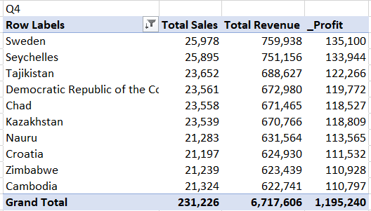
Q4. List top 10 countries by revenue
Do the above procedure for countries. Select first pivot table C2:F15 copy and paste H13. Then in the pivot table fields rows, change month to the country (delete month field in rows and drag and drop country field).
There is a filter menu in the pivot table, row labels cell, select filter from this menu, the value filters and top 10 from the list.
Now select Total Revenue in the by field from the Top 10 Filter dialogue. You can change all parameters in this dialogue, for the customers pivot table we will again come to the Top 10 Filter dialogue and change the number as 100 to list 100 customers.


We now have the pivot table with the top 10 countries by revenue, but it is always good practice to present in descending order. For this, we again go to filter in the pivot table row labels field, select sort in the drop-down list, select Descending radio button and select revenue from the list.


And our pivot table is ready.

Q5. Customer profitability: top 100 customers by profit
Do the procedure above Q4 and filter for 100 customers.


Q6. Employee performance: report top 5 employees who made the highest profits
Do the procedure above Q4 and filter for 5 employees.


This is all for the pivot tables, but before moving to the Dashboard we will do one last thing to show the power of the pivot tables for analysis.
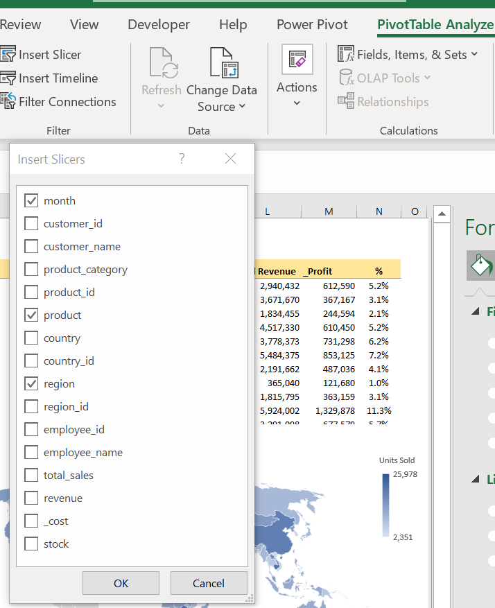
Add a slicer: select any cell in any pivot table, go to PivotTable Analyse menu, select insert slicer tab, click on the month, press OK.

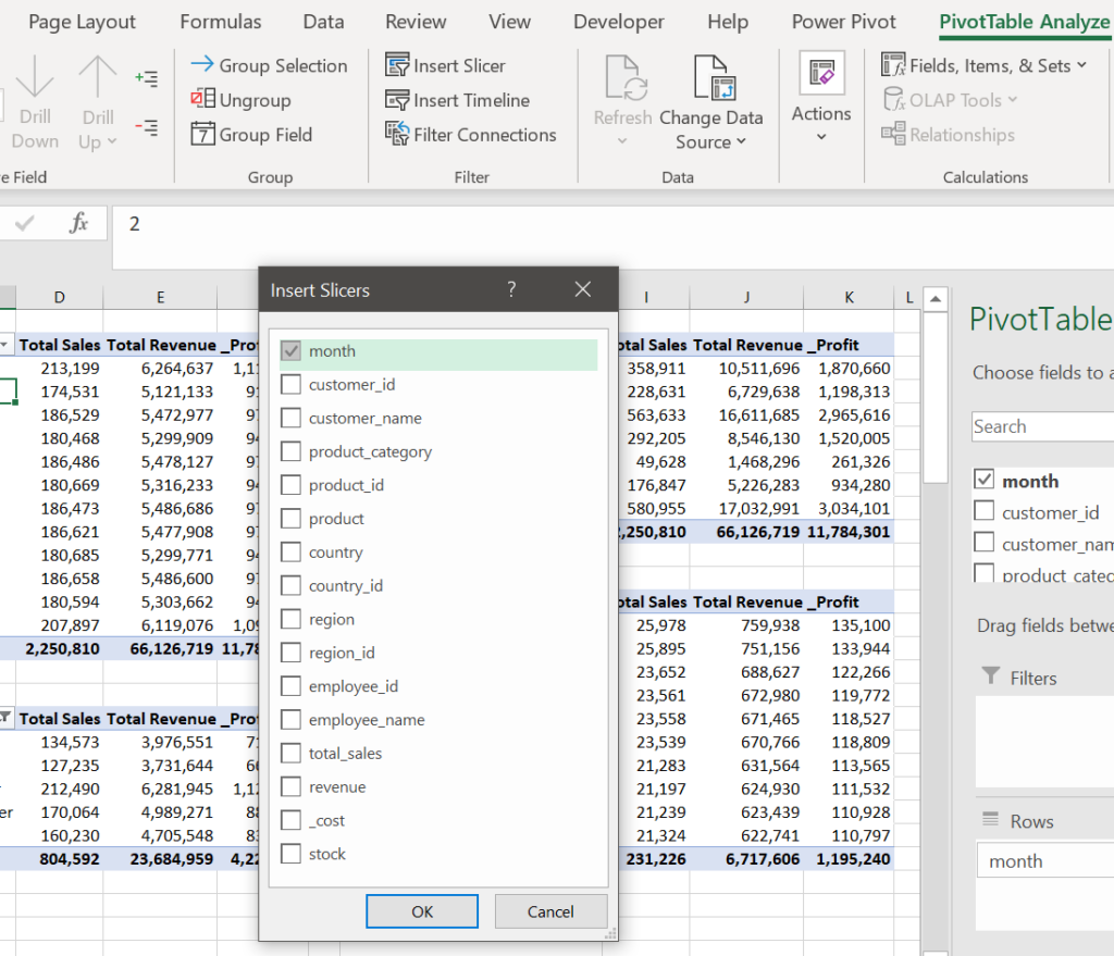
Resize the slicer to see all 12 months, place it over the empty cells on the left and connect all pivot tables to the slicer.
Select slicer, right-click and select report connections. Select all pivot tables and click OK.


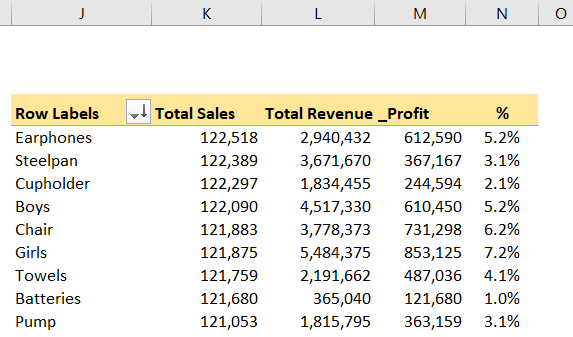
Now play on the slicer buttons to see the changes in the pivot tables. With the 2 buttons at the top of the slicer, you can reset filters or enable multi-select. Below is the result for all tables on month January.

You can add a slicer for each column and use them together, such as to see results from Europe in the first quarter.
We will now go on with the Dashboard.
The Dashboard
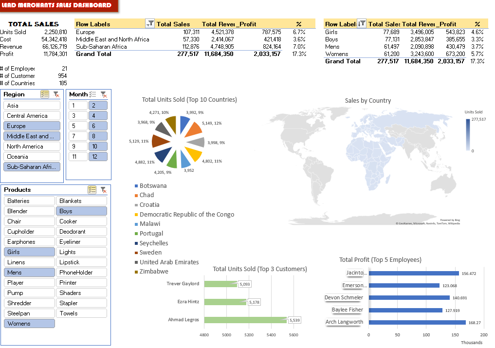
This is where visualisation happens. We will present the results of our analysis with numbers, percentages, graphs and other visuals.
Create a new sheet, name it Dashboard.
The first table is the total sales (cells A3:B11), which presents overall information on Lead Merchants 2019 sales. Prepare it with the below formulas:

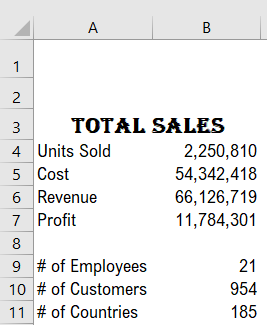
Units Sold B4=SUM(_SU)
Cost B5=SUM(_SC)
Revenue B6=SUM(_SR)
Profit B7= Revenue - Cost
# of Employees  B9=COUNTA(UNIQUE(_ENA)) – the
filter context of dynamic array formula UNIQUE
is used in count function
# of Customers B10=COUNTA(UNIQUE(_CUNA))
# of Countries B11=COUNTA(UNIQUE(_CN))
Set new name - Cell B7= _Profit
Now we will add pivot tables:
Copy the regions table from the Pivot sheet and paste it to cell D3.
In cells H3:H11, near the regions table, we put a new one-column table with formulas. This is the percentages table. It reads the profit numbers from the regions pivot table and divides it to the total profit of the year (cell B7).
Cell H4 =G4/_profit
Copy this cell up to cell H11.
Colour the cells D4:H4 yellow, setting the display as one table.

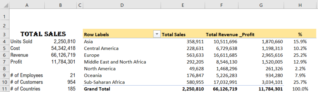
We will also set conditional formatting to cells H4:H11, to make them invisible in case there is no value in the pivot table’s corresponding cell in column G.
Select Home > Conditional Formatting > New Rule.

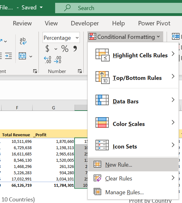
In the New Rule Formatting dialogue, set the rule type to ‘Format only cells that contain’, the cell value is equal to zero and formatting to colour White (fonts same colour with background, thus invisible),

Copy the products table from the Pivot sheet and paste it to cell J3.
Go the process with the regions table again and set profit percentage column, conditional formatting etc.

Now we will add visuals. The visuals are mostly charts and other graphics which visualise the data on data tables such as pivot tables.
We can set the data table on the dashboard and then create the visual over the data table. But the good practice is to create anything that will not be displayed on the dashboard in another sheet.
For that, in our workbook, we have a hidden sheet called Dashboard Tables.
Unhide the sheet Dashboard Tables to view the data backing the visuals on the dashboard.


We will create 4 visuals, and we need to prepare 4 data tables. Create a new sheet for data in your workbook, name it Dashboard Tables;
- Copy the countries table from Pivot sheet to the Dashboard Tables sheet cell B2.
- Copy the customers table from Pivot sheet to the Dashboard Tables sheet cell B15. Set the filter to top 3, we have limited space on the Dashboard.
- Copy the employees table from Pivot sheet to the Dashboard Tables sheet cell B21.
- Copy the countries table from Pivot sheet to the Dashboard Tables sheet cell H2. Remove the filter on this table to display all countries in the table; this will be used for the map visual.
Now we will add our first chart:
Select any cell on the countries table showing the top 10 countries.
Insert Pivot Chart, Insert > Pivot Chart > Pivot Chart

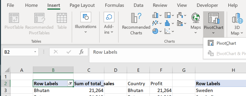
Select Pie chart.


Cut the chart, go to Dashboard cell D14 and paste.
Right-click on the chart and add data labels.
Change the field settings; format all the field settings to set the borders no border, set the legend position to bottom, pull from the mid-bottom (see red arrow below) to enlarge the chart until row 37.


Set the data labels position to outside and change the font size to 12. Select the percentage on the label options.

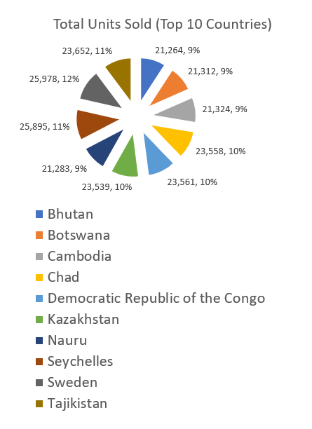
Change the title as Total Units Sold (Top 10 Countries), and set the font to 12.
Right-click on the button on the top left corner and select Hide all field buttons on the chart.
Play with the Pie to give the visual a convenient look.
The countries pie chart is ready.
Now we will add customer and employee charts.
In the dashboard tables, select the customers pivot table and insert the pivot chart Bar.

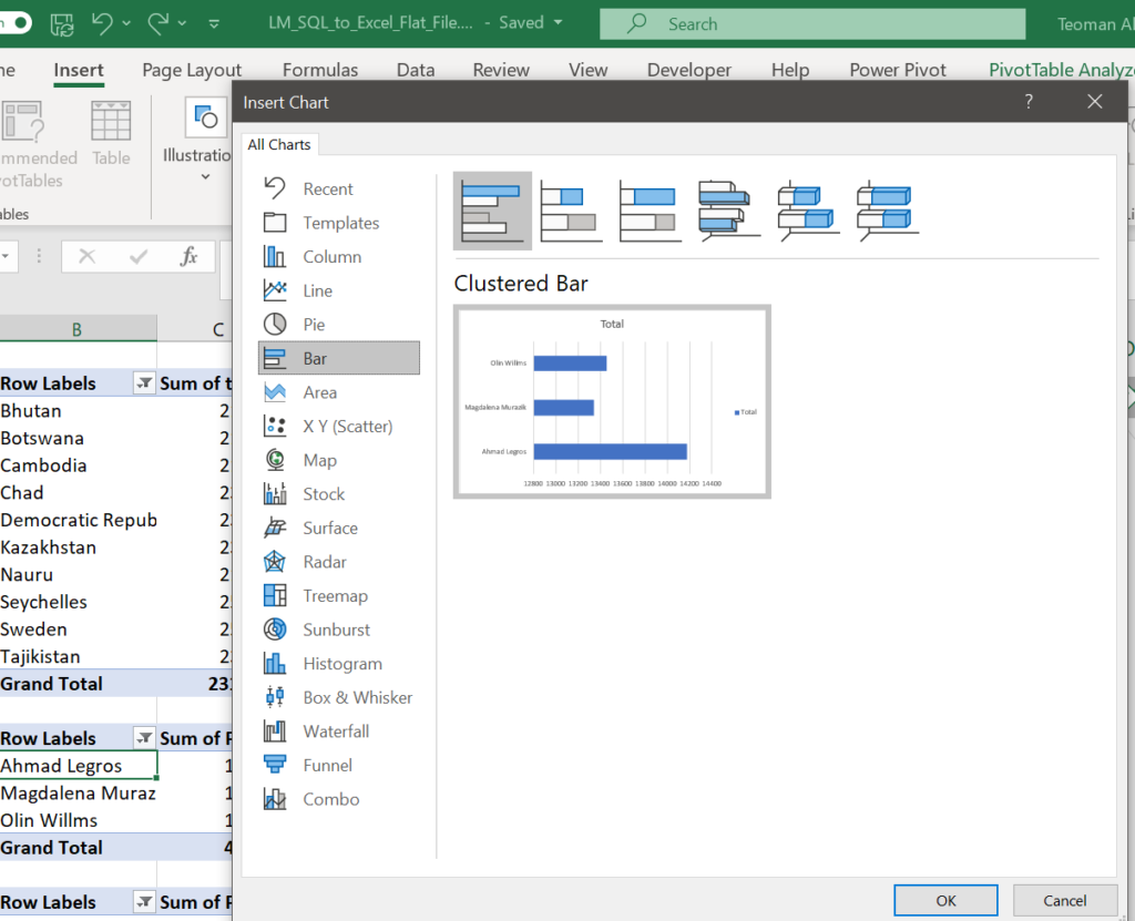
Cut the chart and paste it to Dashboard cell D38.
Do all the edits as the previous table, resize to fit the page.
Do the same process with the employees table, locate it to cell J36 on the Dashboard. You can move the charts by simply dragging them with the Mouse.


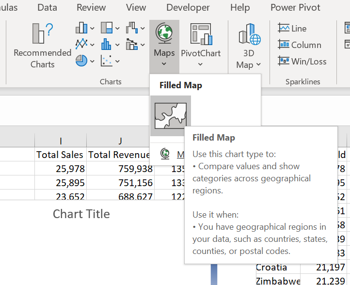
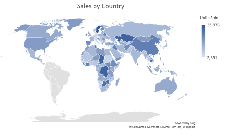
Our final visual is a map. We will show the countries that are trading on a map. As a map by default shows the whole world as an initial display, there is no need to limit our country display by the top 10. For that, we will use a new pivot table for countries with no filters on it. In the pie chart, it was not practical to display more than 10 countries.
A map can not base on pivot tables. So using our new countries pivot table, we will create another data table that is not a pivot table.
On the Dashboard Tables sheet, name the cells M2:N2 as Country and Units Sold (we will display units sold by the country in the map).
Cell M3 =H3
Cell N3 =I3
Copy these 2 formulas down to row 187, till to the end of the country pivot table.
Select any cell on the new countries table and insert the map.

Cut and paste the map to Dashboard cell G15, enlarge it up to cell O35. Remove the borders of the map.

Resize and move the charts and map to get the best view on the Dashboard.
Now it is time to add slicers, one of the most important features of a dashboard. Slicers give depth to the analysis and dynamism to the dashboard.
We will add 3 slicers. PivoTable Analyze > Insert Slicer > select the month, product and region slicers from the dialogue.

Move the region slicer to cell A13, resize it to narrow it until the mid of cell B13.
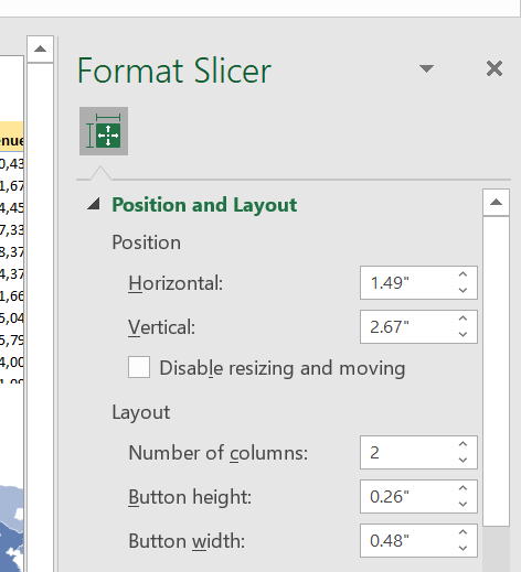
Select the month slicer, change the layout Format Slicer > Position and Layout > Number of Columns “2”.
Move it immediately near the region slicer, resize it to narrow until all the numbers of the pie chart is visible.

Now set the product slicer to 3 columns, move and fit it below region and month slicers.
Set slicer connections as previously shown, for all slicers to all the tables and charts on the table.
Clear the gridlines of the Dashboard sheet, arrange the layout to landscape and print preview.
Work on cosmetics as you like. Change chart displays, add background, pictures or other visuals.
And finally, put a name on the Dashboard. The red LEAD FINANCE SALES DASHBOARD label is prepared in Microsoft Word.
Play with the slicers as you like for an in-depth analysis.

Next week we will go on with the Power Pivot where we will use all 5 tables of the Lead Merchants database including the 2 million rows order table.