The Pivot
Although using the formulas are the best approach for reporting in Excel, with the kind of work we are doing pivot tables are the fastest and most convenient solution.
Q1. Monthly sales totals of Lead Merchants (units sold, revenue, profit)
Create a new sheet, name it Pivot.
Create a pivot table showing month on rows and units sold and revenue on columns from our data on sheet Pivot starting from cell C2. See how to create the pivot table.
On the pivot table, right-click on grand total and select value field settings. In this dialogue select number format and select number and comma as a separator with 0 decimals.

Do the same for the other grand total field. Now change the column names to Total Sales and Total Revenue.
We now have the monthly total units sold and revenue in our table. We can also add cost directly from our dataset, but the dataset does not have a profit column, for that we will add a calculated column to our pivot table.
From the PivotTable Analyze menu select the ‘Fields, Items, & Sets’ tab, select the Calculated Field from the drop-down list.
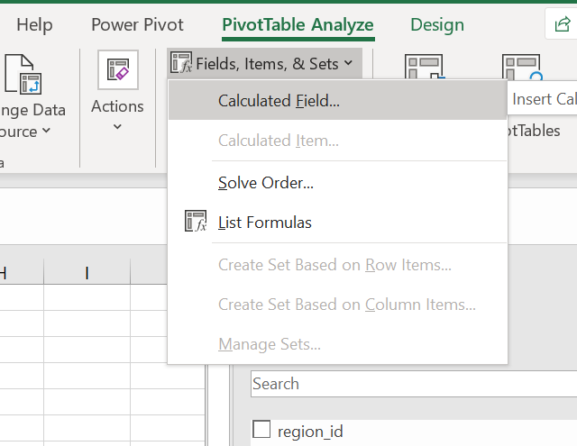
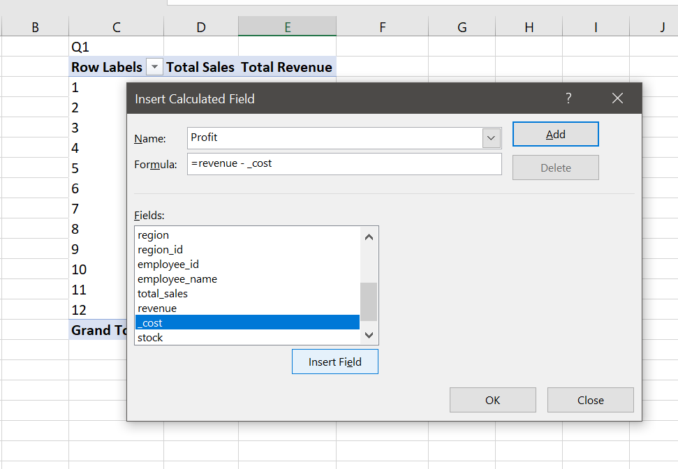
We create a field named Profit, which subtracts cost from revenue.
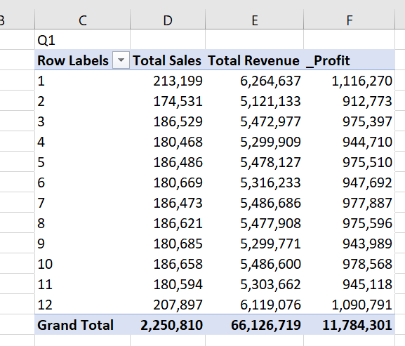
Finally, we change the name of the column we added as _Profit, and our first pivot table is ready.
One last thing, another good practice is to properly name the pivot tables, especially when you are working with more than one table.
Right-click on the row labels cell, select PivotTable options and change the name as Month. Do this for all the tables that will be prepared in this workshop.

Q2. Report regional sales figures (units sold, revenue, profit)
Select first pivot table C2:F15 copy and paste H2. Then in the pivot table fields rows, change month to the region (delete month in rows field and drag and drop region field).

Name the pivot table as region.
Q3. Sales by product (units sold, revenue, profit)
Do the above procedure for products. Select first pivot table C2:F15 copy and paste M2. Then in the pivot table fields > rows, change month to the product (delete month in rows field and drag and drop product).

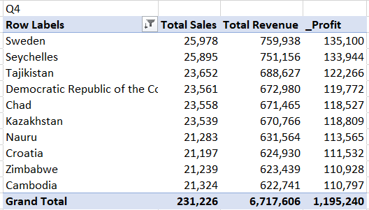
Q4. List top 10 countries by revenue
Do the above procedure for countries. Select first pivot table C2:F15 copy and paste H13. Then in the pivot table fields rows, change month to the country (delete month field in rows and drag and drop country field).
There is a filter menu in the pivot table, row labels cell, select filter from this menu, the value filters and top 10 from the list.
Now select Total Revenue in the by field from the Top 10 Filter dialogue. You can change all parameters in this dialogue, for the customers pivot table we will again come to the Top 10 Filter dialogue and change the number as 100 to list 100 customers.

We now have the pivot table with the top 10 countries by revenue, but it is always good practice to present in descending order. For this, we again go to filter in the pivot table row labels field, select sort in the drop-down list, select Descending radio button and select revenue from the list.

And our pivot table is ready.
Q5. Customer profitability: top 100 customers by profit
Do the procedure above Q4 and filter for 100 customers.

Q6. Employee performance: report top 5 employees who made the highest profits
Do the procedure above Q4 and filter for 5 employees.

This is all for the pivot tables, but before moving to the Dashboard we will do one last thing to show the power of the pivot tables for analysis.
Add a slicer: select any cell in any pivot table, go to PivotTable Analyse menu, select insert slicer tab, click on the month, press OK.
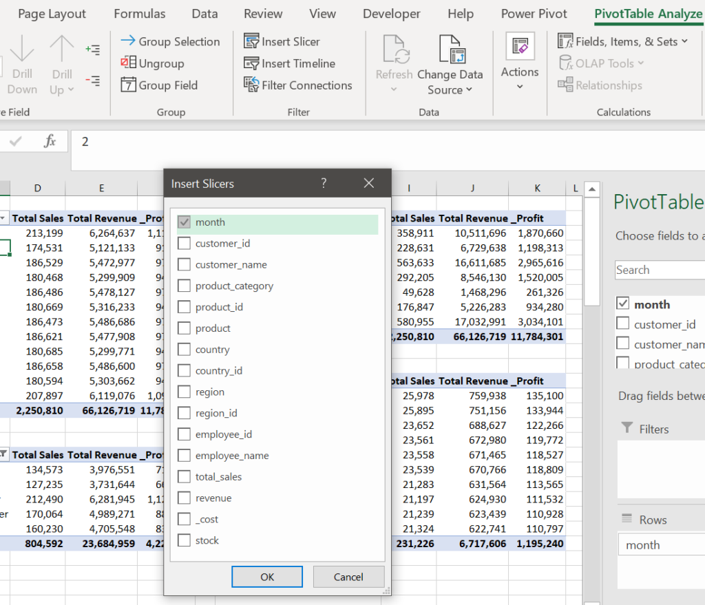
Resize the slicer to see all 12 months, place it over the empty cells on the left and connect all pivot tables to the slicer.
Select slicer, right-click and select report connections. Select all pivot tables and click OK.

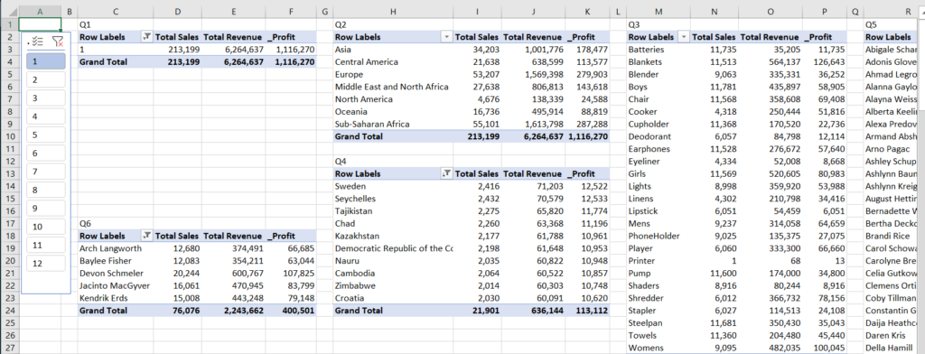
Now play on the slicer buttons to see the changes in the pivot tables. With the 2 buttons at the top of the slicer, you can reset filters or enable multi-select. Below is the result for all tables on month January.
You can add a slicer for each column and use them together, such as to see results from Europe in the first quarter.
We will now go on with the Dashboard.