


Power BI is an Analytics and Business Intelligence platform. Microsoft defines it as ‘a collection of software services, apps, and connectors that work together to turn your unrelated sources of data into coherent, visually immersive, and interactive insights’.
Power BI consists of:
- A Windows desktop application called Power BI Desktop
- An online SaaS (Software as a Service) called the Power BI service
- Power BI mobile apps for Windows, iOS, and Android devices
Working with these 3 elements, a data analyst creates the content using data and distribute it to the stakeholders, the users of the content.
‘As a designer, your typical workflow is usually to start by creating reports in Power BI Desktop. Then you publish them to the Power BI service, where you can continue modifying them. You also create the dashboards based on your reports in the Power BI service.’ Microsoft Docs
In the previous part, we worked with Power BI Desktop, prepared reports, the sales report and the sales dashboard (which is still a report on the PBI desktop). In this part, we will work with the Power BI Service and mobile apps.
Power BI service runs on the cloud and it does not create a downloadable file. You can download reports or presentations but the reports and dashboards prepared on the cloud can be examined on the cloud. So for this part, we will not create a pbix file, we will do some downloads, and we will share the dashboards and reports online.
Go on with the workshop on Power BI Service.
Power BI Service
Power BI Service (PBS) is the online platform of Power BI. Although it has a lot of features that enables to do work directly in the service, it is effectively designed to be an extension of the PBI desktop. PBI Desktop’s data transform and load capabilities allow the design and modelling of data for analysis. PBI service takes this to the cloud, allows collaboration and design, and then distribute the results of the analysis to users, online.
Open the LM Analysis of 2019 Sales.pbix file.
Click on the Publish button on the Home menu.

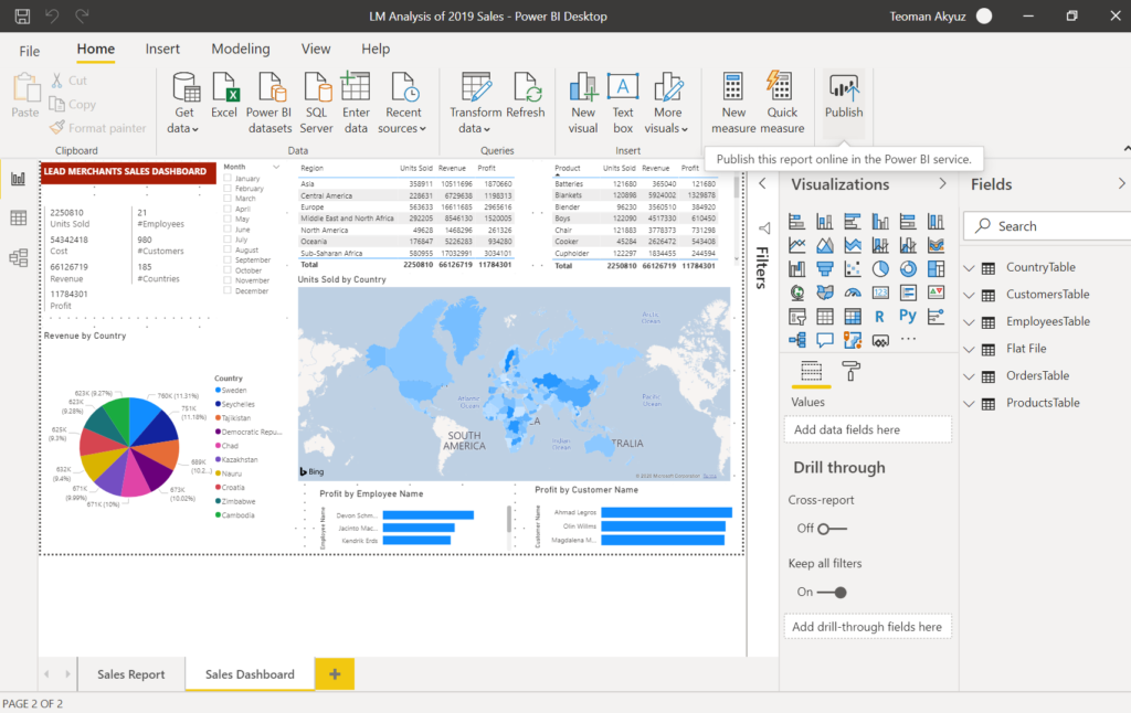
In the Publish to Power BI dialogue select My workspace.

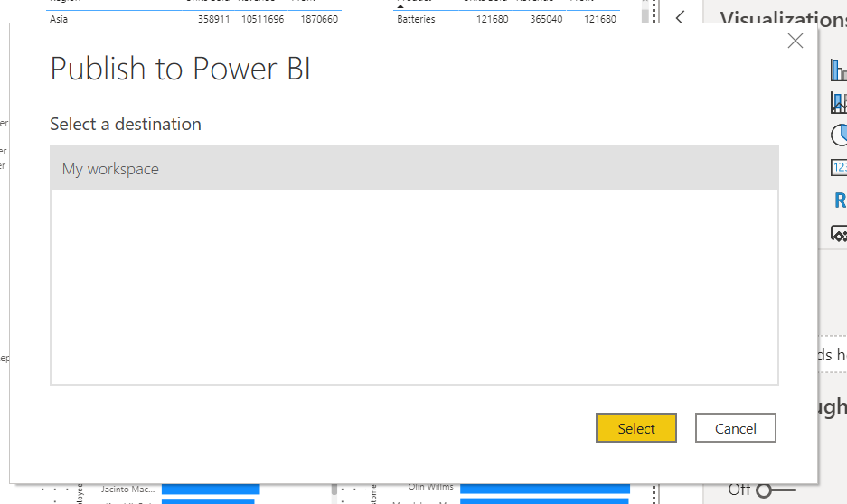
After the Success message select ‘Open LM Analysis of 2019 Sales.pbix in Power BI’.


Power BI Service will open in a browser window, from the menu on the left select My workspace. This is where we just loaded our reports.
Power BI Service is also continuously improved with new features by Microsoft. One of the later implemented features is the new look, we will do this workshop with the new look off.

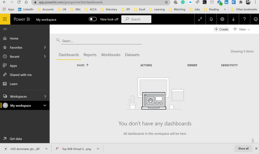
We do not have Dashboards yet, click on reports to see the 2 pages-report we have prepared in PBI Desktop.

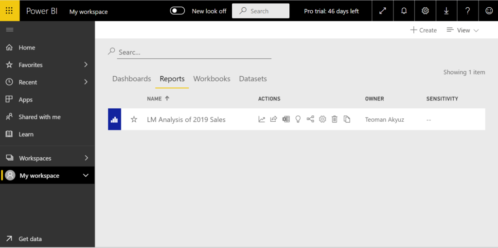
And select the LM Analysis of 2019 Sales report to examine the reports we have prepared in PBI Desktop. You can see the 2 pages we have prepared on the desktop. Select the Sales Dashboard from the page tabs at the bottom.

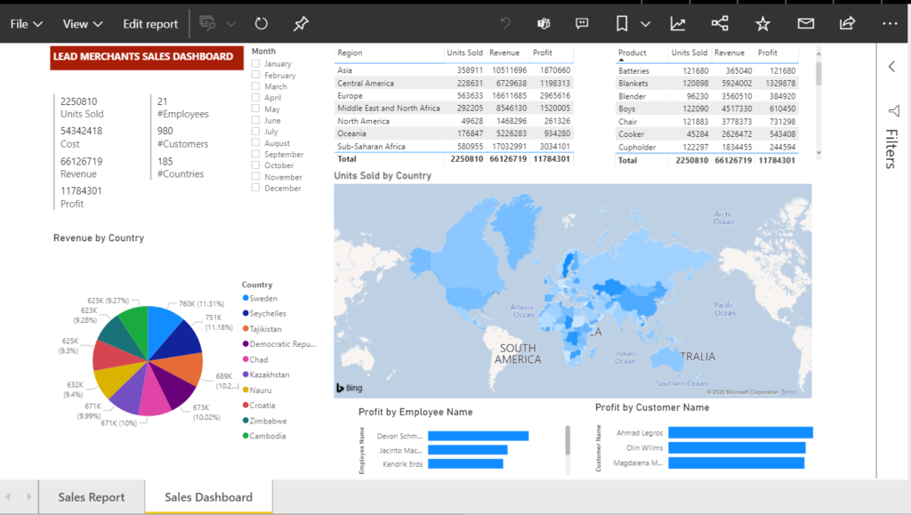
We will edit the report ‘Sales Dashboard’ and add another visualisation.
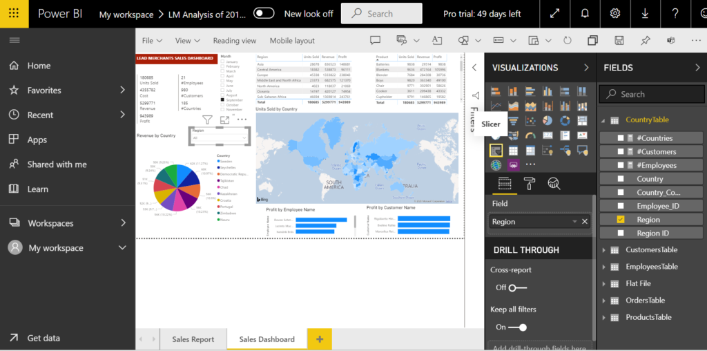
Press the Edit report button, the edit view will open.


From the VISUALIZATIONS tab, select the slicer visualisation, move and resize the empty visualisation to fit on the report. From the FIELDS Tab select CountryTable > Region. In the slicer, click on the small arrow at the top-right and choose Dropdown.

Now click on the reading view and press save in the coming dialogue.
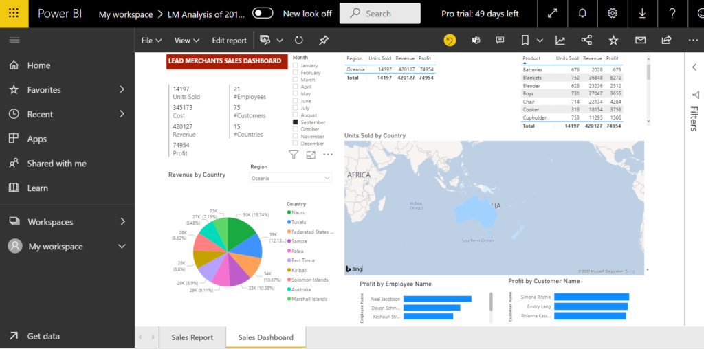
You can play with the filters and slicers to get some insights.
Below, the Sales Dashboard report showing September 2019 results for the Oceania region.
When you set the filters and reach the results you are looking for, add a bookmark before moving forward to easily come back to the same place later.


On the file menu, there are options to save, print, export as pdf or publish the report on the web. Export a pdf copy of the report page with the desired filters.
On the Sales Report page, select September and Oceania by pressing the Ctrl key.


Add another bookmark.
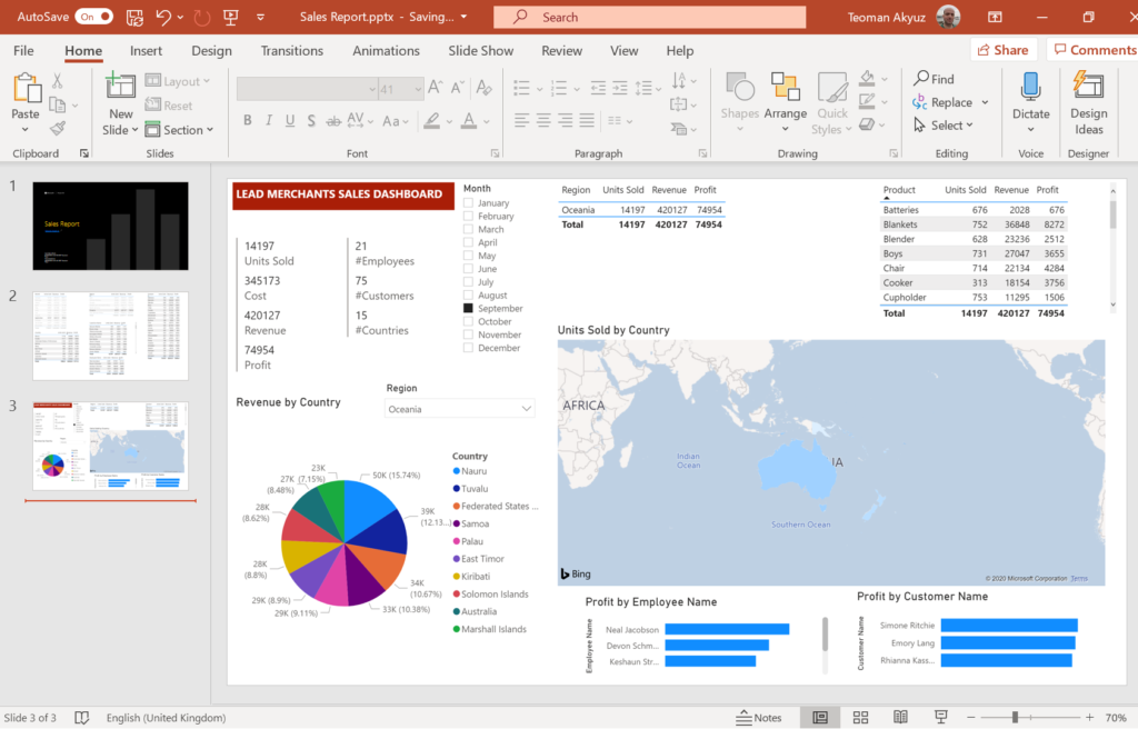
Under the file menu, you can find commands to save, print or export reports as pdf, or publish them on the web. Select Export to PowerPoint, from Export dialogue select current views.


PBS downloads the PowerPoint file to your default download folder. We now have a ready to present PowerPoint presentation with a title page and 2 slides for our 2 reports.

Now press the yellow reset button to take the reports to their initial position.


Save the report at this final state, File > Save as, Name as ‘PBS – 2019 Sales’. You will see the report we just saved under My workspace > Reports.
Next, we will see how to create Power BI Service dashboards.
The Dashboard
‘A Power BI dashboard is a single page, often called a canvas, that uses visualisations to tell a story. Because it is limited to one page, a well-designed dashboard contains only the most important elements of that story.’ Microsoft Docs
We will now create a PBS Dashboard. The dashboards are useful for presenting visuals from various PBI reports.
Open the PBS – 2019 Sales report, go to the Sales Dashboard page.
You can mix and match visuals on this page and other pages and pin them on the dashboard. The filters and slicers can not be added to the dashboards.
Hover the mouse pointer on the pie chart to make the buttons visible, and click on the Pin visual button.

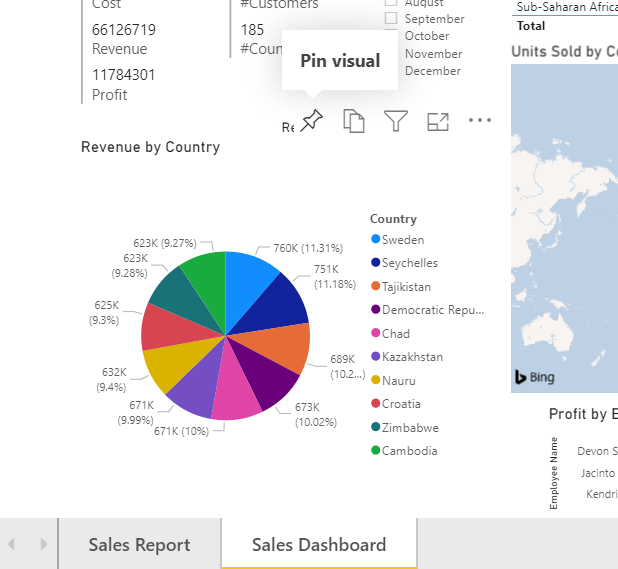
Pin to dashboard dialogue will open. Select New dashboard and name the dashboard.
This will create a new dashboard and pin the pie chart visual on it. Click pin.


A new dialogue opens asking if we want to create a phone view org o to the dashboard. Press Go to dashboard. The visual is now pinned to the dashboard.


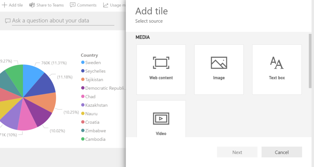
The visuals on the dashboard are called tiles. We will add more tiles to this dashboard.
Click on Add tile button on the upper left. As you will see from the Add tile dialogue, we can add web content, image, text box, video or live feed.
In the web content tile, you can show LinkedIn, Twitter, Instagram posts, or posts from other websites.
We will add the Power BI workshop post from LinkedIn.

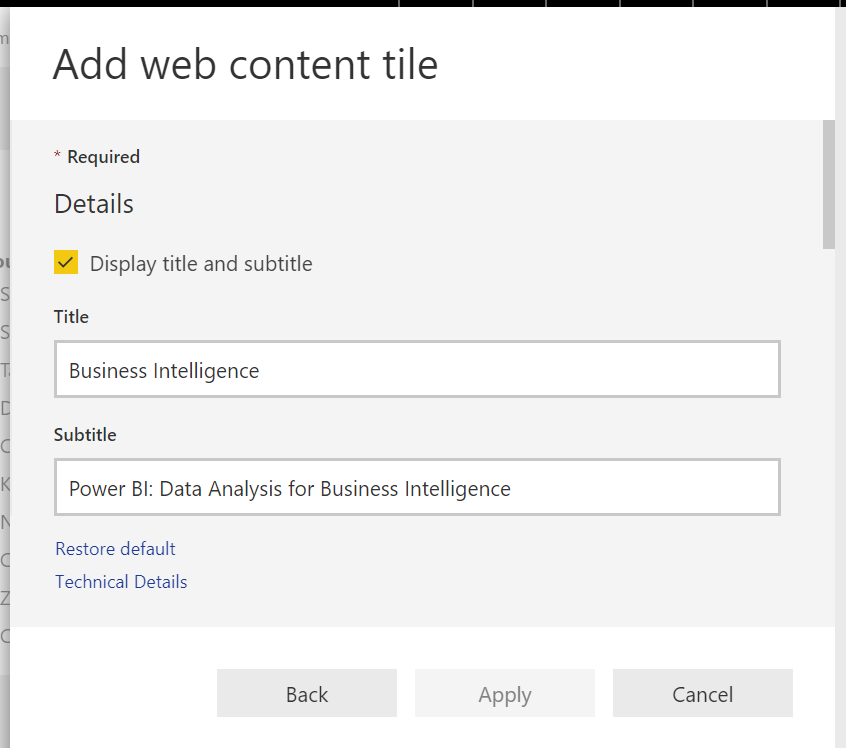
Select Web content, Add web content tile will open.
Write a Title and Subtitle and check the Display Title and Subtitle box.

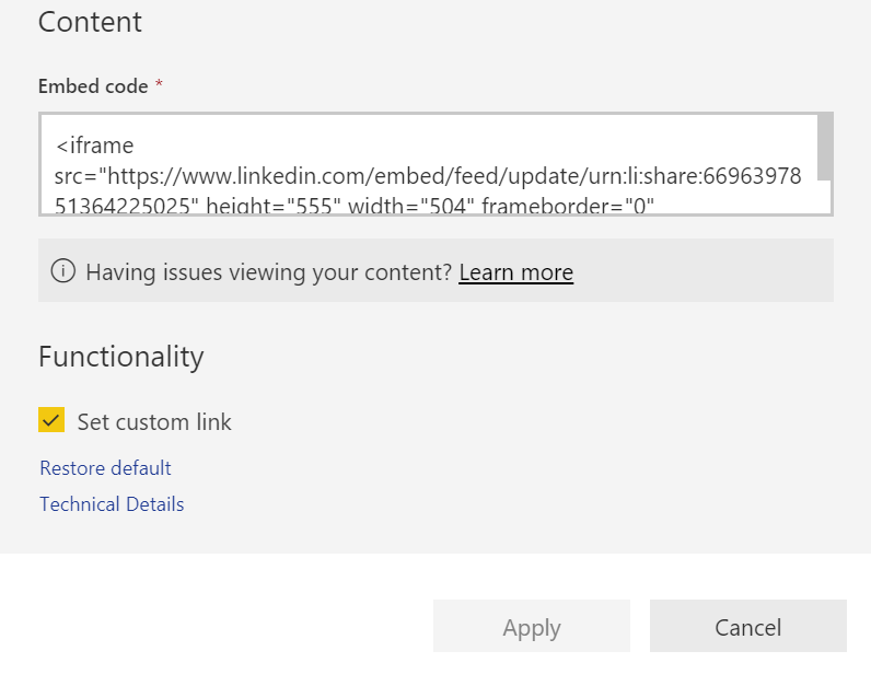
Scroll down in the dialogue; under content embed the code which you will take from the LinkedIn post (or any other website you will add content from), and then you can also set the external link to the page as a custom link.
The Embed Code (produced by LinkedIn):
<iframe src="https://www.linkedin.com/embed/feed/update/urn:li:
share:669639785136422505" height="555" width="504" frameborder="0"
allowfullscreen="" title="Embedded post"></iframe>

We will go on and a few more tiles from our reports on this dashboard.
Go to the Sales Report page, add the Profit by Customer and Monthly figures tables and go to the Sales Dashboard page and add the Profit by Employee bar chart. While adding choose add to the existing dashboard and choose the dashboard we just created.
You can hover any tile, click More options and edit or remove tiles in the dashboard.
We can also add an entire report by pinning the whole page to a dashboard. As mentioned before we can not add filters or slicers to the dashboards individually but when a page is pinned to a dashboard it is pinned wholly, including slicers and filters.
Go to the sales dashboard and click on the pin button at the top menu, pin a live page.


The dashboards are ready, and we will go on with the distribution of reports and dashboards.
Distribution
The Power BI reports and dashboards can be delivered over a webpage (internal or external) or mobile platforms.
We will start with mobile platforms, design a dashboard to view on the phone and then publish a report on the web.
Phone
When you install the Power BI mobile application to your phone or tablet device and login with your account, you can already see your workspace and the reports and dashboards you have created. You can share the reports and the dashboards with other people in your organisation. For the best viewing, you must arrange the phone view.
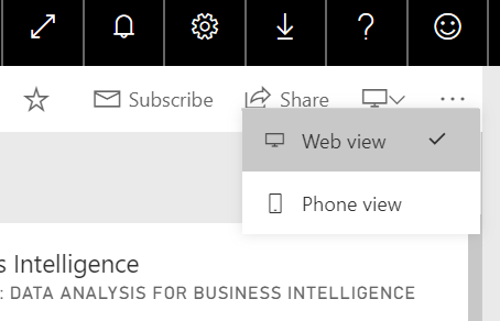
For that, we have to arrange the phone views of the dashboards we have prepared. In the ribbon, click on the switch view button and select phone view.

When the phone view opens, we will edit the dashboard for the best viewing on a smartphone.
We do not want to see the embedded LinkedIn post in the phone view. Click on Hide tile to remove the tile in this view.

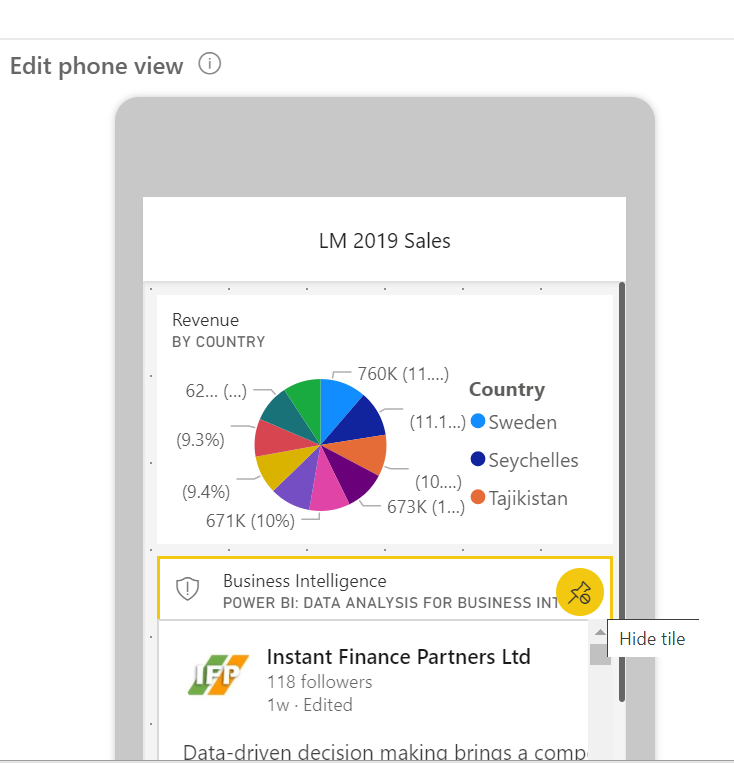
Now we will put the tiles in the desired order. Scroll down, select Month tile and drag it just below the pie chart tile.


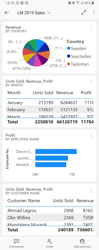
Now open the Power BI app on your mobile, go to My workspace > Dashboards > LM 2019 Sales dashboard and see the phone view we have created for this dashboard. When this dashboard is shared with other people in the organisation, they will only see this dashboard with this view.
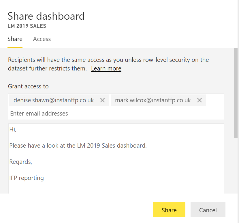
To share the dashboard, click on the Share button on the PBS ribbon.


The Share dashboard dialogue opens. Enter the emails of the persons you want to share this dashboard with. They must be in your organisation, have their email in the same domain with you. Sharing people outside the organisation will require additional authorisation.
Write a message to the people who will examine the dashboard and click share.

You will receive a success message.
The people you have shared the dashboard will receive an email with your message and a button to open the dashboard. They can view the dashboard from their computer or from their mobile device. If they open the dashboard from their smartphone, they will see the phone view.
In the phone view, users can open individual tiles and examine in detail.

You can add more tiles to present the information in the desired depth. But the slicers and filters add even more depth as the users themselves steer some of the analysis. We could share the live page, but it is not phone friendly, it can be useful to share this dashboard, but for the users who will view smartphones, we will arrange another report, which will be phone friendly and pin that as a live page.
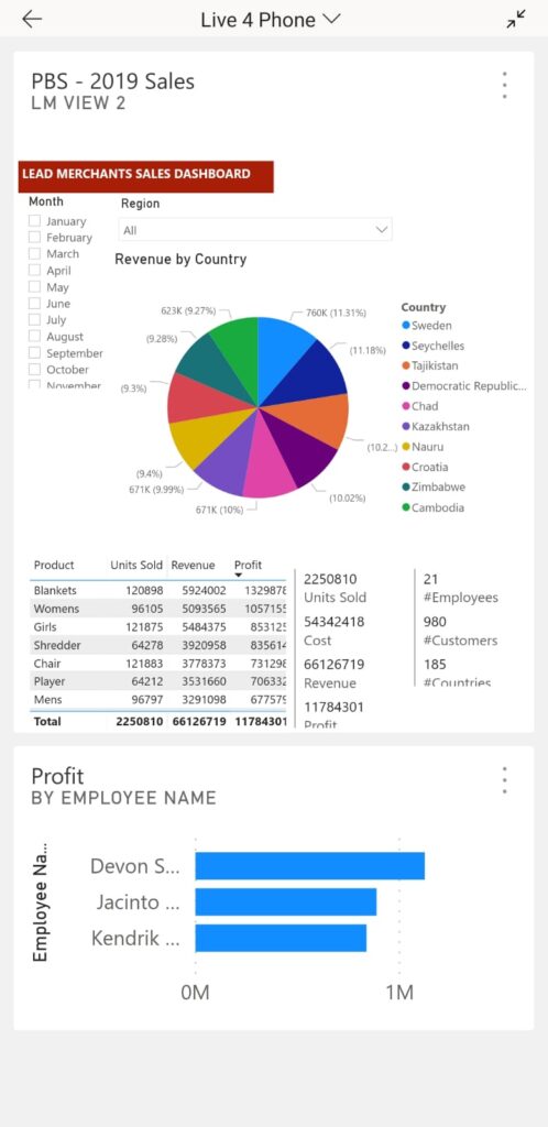
We will go to PBS – 2019 Sales report, duplicate the Sales Dashboard page. In the report open the edit view and click Duplicate this page. Right-click the new page and rename it as Live View 2.


On the new page keep the month filter, region slicer, sales totals and numbers multi-row cards, pie chart and product table. Delete all other visuals. Order these visuals as a column in the page and resize the page.
Got o VIZUALIZATIONS > Format painter > Page size > Type select Custom.


In the Custom field, set width 640 and height 720 pixels.
Add another tile, employees table from the first dashboard we prepared. On phone, there will be 2 tiles in the dashboard, the Live View 2 page is a tile, and the employees table is the second tile. The filter and slicer can be accessed only when the first tile is being viewed.

Publish on the web
The other option for distributing results is to publish the reports over the internet or the company intranet. Only reports can be published, and there are 2 options to publish reports on the web:
Embed – Embeds the report on the web for use by the employees of the organisation. The owners of the report must authorise anybody who wants to use this report.
Publish to web – The report will be published on a website on the internet and anybody can visit the site it is published and view the dashboard, perform the analysis using the filters and slicers.
To use the web publishing features of PBS you have to subscribe to the pro version. There is a 60 days free trial period that allows testing of all features.
Although publishing the company data over the internet is not in any way an acceptable application, especially as our data includes customer and employee details, the Lead Merchants Sales Database with all its content is fictitious, there is no real information including customers and employees that would prevent us from publishing.
The distribution is easy, open the file menu, select Publish to web.


You will receive an ‘Embed in a public website’ dialogue.

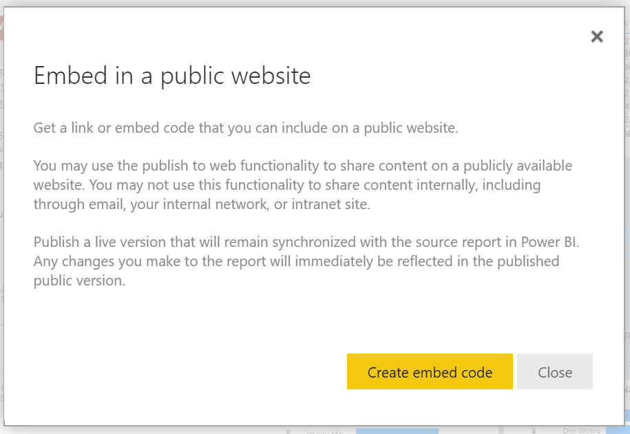
The important information here is the last paragraph.
When you publish a PBI report on the web;
- the report is published with all pages (3 pages of Sales Report)
- it has a live connection to the Power Bı Service (and data),
- when you edit the report, such as adding visuals to a page, this webpage will be updated (when the page reloaded)
After pressing the embed code a new dialogue box pops up, first set the size to 1024 x 804 px.
Then we have to use the code.
The first code is sent a link by email, and you can just copy this code and send this by email. After this dialogue box is closed the link to report will be active and public under the Power BI site.
We will publish this report on our company page, we will copy the embed code.


We will copy the embed code and embed it to a page under Instant Finance Partners website.
You can view the report online. When you go to this webpage, you’ll see the 3 pages of our Sales Report. Do not forget to play with the slicer and filter on the Sales Dashboard page. Hover on the visuals, use the buttons to examine them in more detail.
In the next and final part of this workshop, we will look at the ways we can automate the analysis and reporting processes, simulate a live connection to the LM database and have a look at the AI in Power BI.