The Dashboard
‘A Power BI dashboard is a single page, often called a canvas, that uses visualisations to tell a story. Because it is limited to one page, a well-designed dashboard contains only the most important elements of that story.’ Microsoft Docs
We will now create a PBS Dashboard. The dashboards are useful for presenting visuals from various PBI reports.
Open the PBS – 2019 Sales report, go to the Sales Dashboard page.
You can mix and match visuals on this page and other pages and pin them on the dashboard. The filters and slicers can not be added to the dashboards.
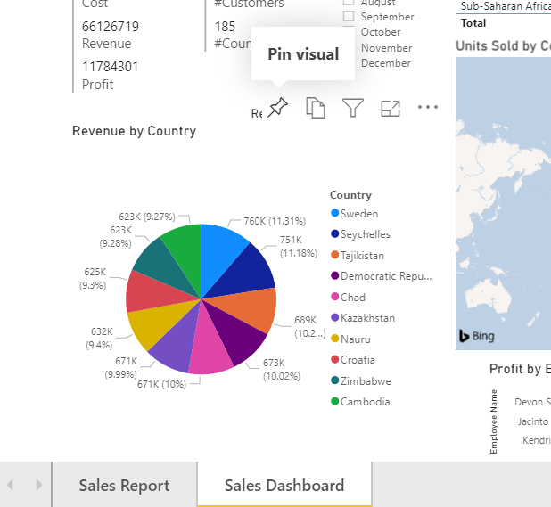
Hover the mouse pointer on the pie chart to make the buttons visible, and click on the Pin visual button.
Pin to dashboard dialogue will open. Select New dashboard and name the dashboard.
This will create a new dashboard and pin the pie chart visual on it. Click pin.

A new dialogue opens asking if we want to create a phone view org o to the dashboard. Press Go to dashboard. The visual is now pinned to the dashboard.

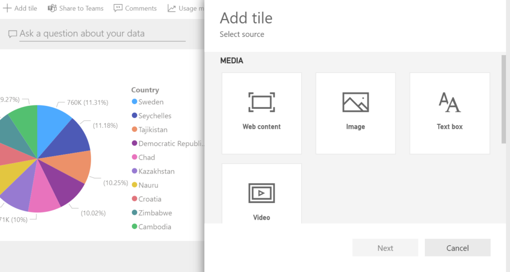
The visuals on the dashboard are called tiles. We will add more tiles to this dashboard.
Click on Add tile button on the upper left. As you will see from the Add tile dialogue, we can add web content, image, text box, video or live feed.
In the web content tile, you can show LinkedIn, Twitter, Instagram posts, or posts from other websites.
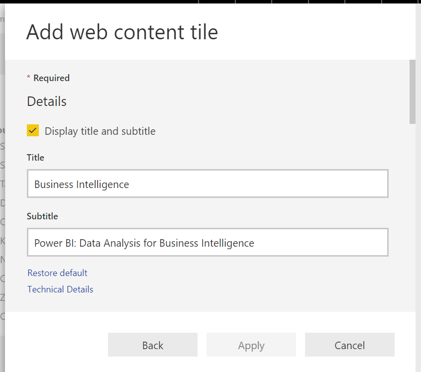
We will add the Power BI workshop post from LinkedIn.
Select Web content, Add web content tile will open.
Write a Title and Subtitle and check the Display Title and Subtitle box.
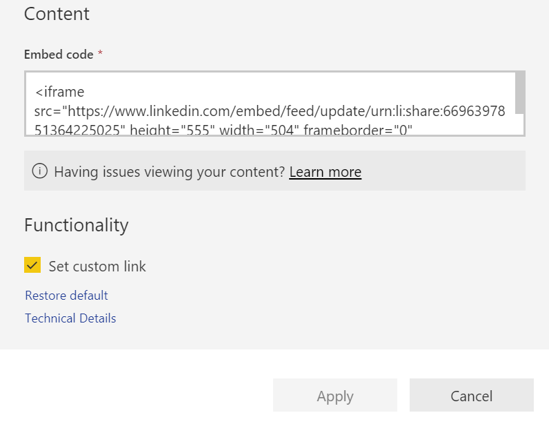
Scroll down in the dialogue; under content embed the code which you will take from the LinkedIn post (or any other website you will add content from), and then you can also set the external link to the page as a custom link.
The Embed Code (produced by LinkedIn):
<iframe src="https://www.linkedin.com/embed/feed/update/urn:li:
share:669639785136422505" height="555" width="504" frameborder="0"
allowfullscreen="" title="Embedded post"></iframe>
We will go on and a few more tiles from our reports on this dashboard.
Go to the Sales Report page, add the Profit by Customer and Monthly figures tables and go to the Sales Dashboard page and add the Profit by Employee bar chart. While adding choose add to the existing dashboard and choose the dashboard we just created.
You can hover any tile, click More options and edit or remove tiles in the dashboard.
We can also add an entire report by pinning the whole page to a dashboard. As mentioned before we can not add filters or slicers to the dashboards individually but when a page is pinned to a dashboard it is pinned wholly, including slicers and filters.
Go to the sales dashboard and click on the pin button at the top menu, pin a live page.

The dashboards are ready, and we will go on with the distribution of reports and dashboards.