


Data Analysis is evolved into a science in the last decade, and the tools used for analysis were developed to deal with massive amounts of data. MS Excel caught up with this evolution with Power Pivot.
Power Pivot implements the features of database software such as database tables and relationships, adds its calculation engine with a language designed explicitly for analysis over Power Pivot, the Data Analysis Expressions (DAX), and reports analysis results with pivot tables and visualisations such as dashboards on Excel.
Power BI took potent features of Power Pivot and supported them with many improved features for analysis and presentation of data. It is also built on a similar database table structure and relationships, DAX engine and dashboard design features.
For ETL (extract, transform, load) operations Power BI has a separate tool, the Power Query, which is a much-improved version of “Get & Transform Data” of Power Pivot. It has a service component that allows online analysis and publishes the analysis reports on the web or mobile platforms. It has embedded AI capability and is a member of Microsoft’s Power Platform suite of applications.
Microsoft defines Power BI as a self-service business intelligence tool, “a collection of software services, apps, and connectors that work together to turn your unrelated sources of data into coherent, visually immersive, and interactive insights”.
While Power BI is accepted as a leader in the business intelligence realm, it is also a work in progress, evolving into a much stronger tool with hundreds of features added every year by Microsoft.
We will start our analysis by loading Lead Merchants Sales Database tables to Power BI and setting relationships between these tables. Then we will answer our questions with the analysis of the sales database with Reports, and we will prepare the same dashboard we developed in Excel.
While Power BI is one of the most powerful tools for business intelligence, it is not designed to prepare bespoke reports. The major tool for reporting and building business models and calculations is still classic Excel. So as a final step, we will prepare the flat file we previously have arranged with SQL and Power Pivot to use in classic Excel.
You can download the Power BI file used for our analysis from the link below. If you want to follow the workshop performing the step-by-step instructions yourself, you can find the Lead Merchants Database tables here.
You can download and install the Power BI desktop here, and there is also a desktop application in Microsoft Store. Power BI is a Windows-only program and can not be installed on Mac unless it is using the Windows operating system. Installation is straightforward, and you need to register to use the software with service functionality.
In the first part, we will start with Power BI Desktop and load our tables. We will prepare the Report to answer the questions and the Dashboard, the same way we have done in SQL and Excel. Finally, we will again prepare the Flat File to summarise the data to use in Excel.
Next, we will explore Power BI Service, distributing our reports online over the internet and mobile devices, have a look at the AI and connection to systems for automation.
Power BI Desktop
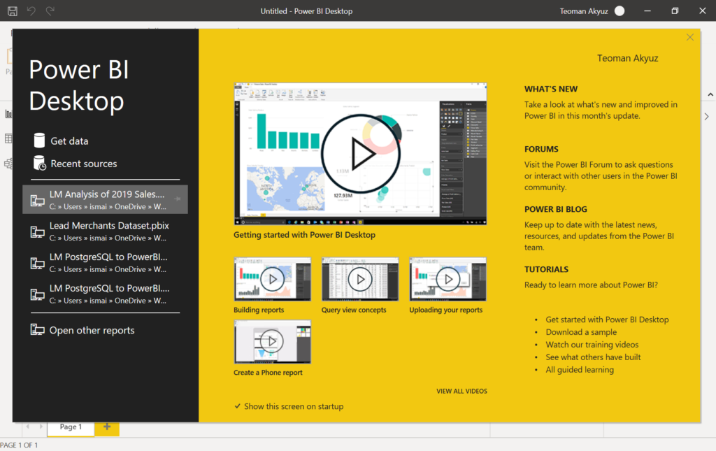
Open the Power BI (PBI) desktop, sign in, and the program starts with the below dialogue box.

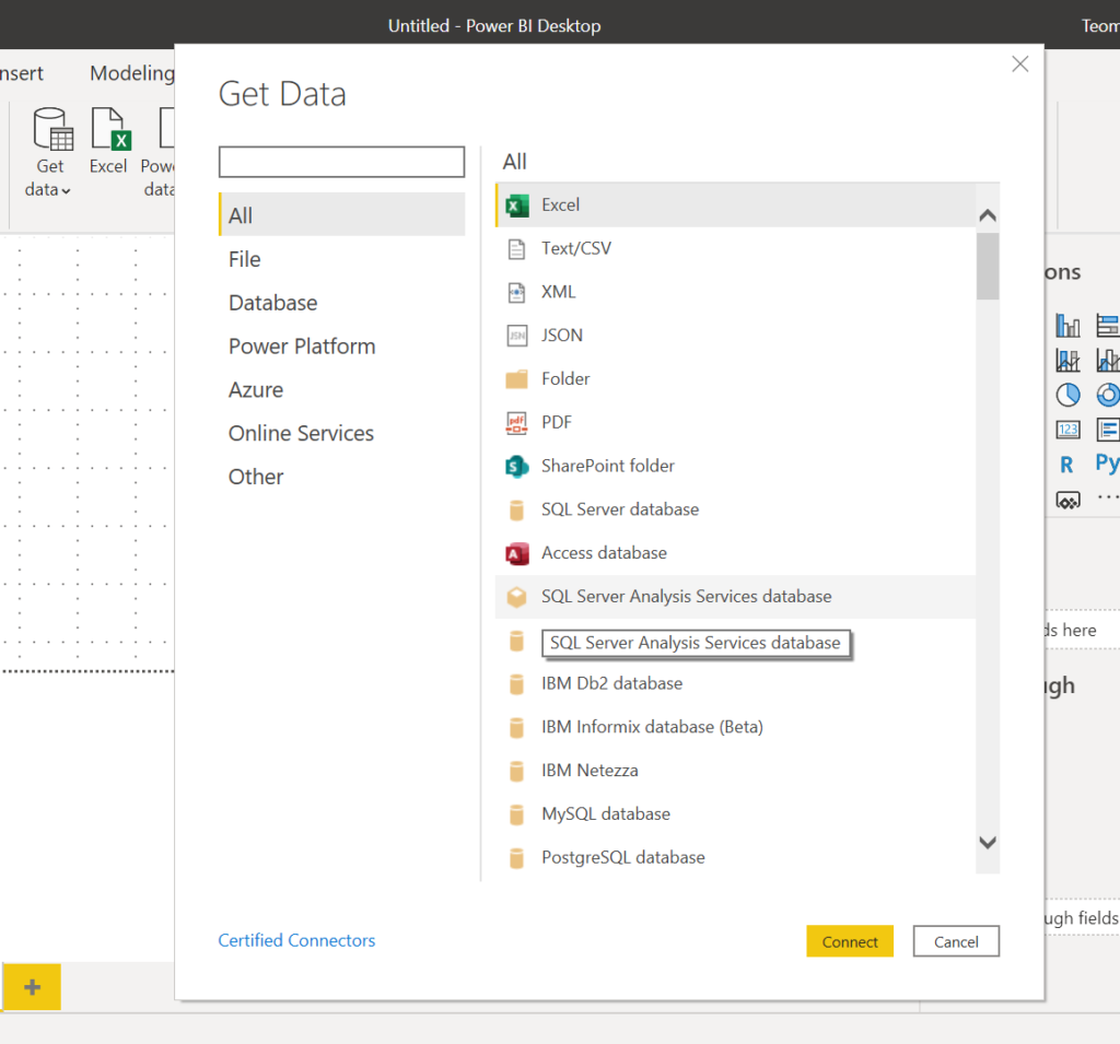
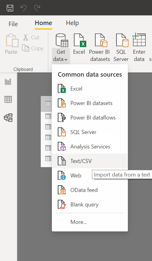
Press get data and get the data dialogue box opens. Here you can see there is a very long list of data/container types you can load to Power BI. Scroll down the list to see the list. An important feature of PBI is you can load data from different resources and add different types of data to your data model.

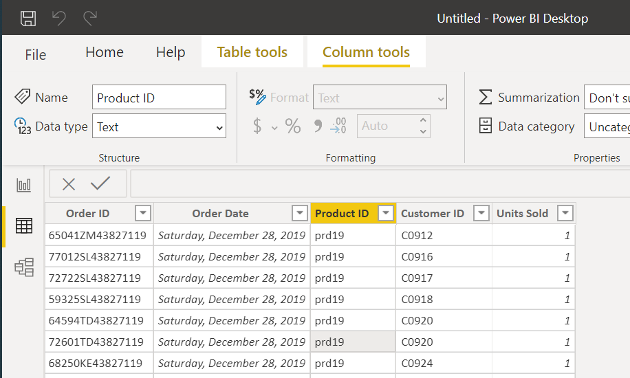
We have LM Sales database tables in CSV format. Select Text/CSV, find the orders table from the load dialogue, and you’ll reach a new dialogue box showing the columns of the orders table along with some data and specifications of the table.
PBI recognised the colımn names in the first row, if not we have to transform data to add column headers.

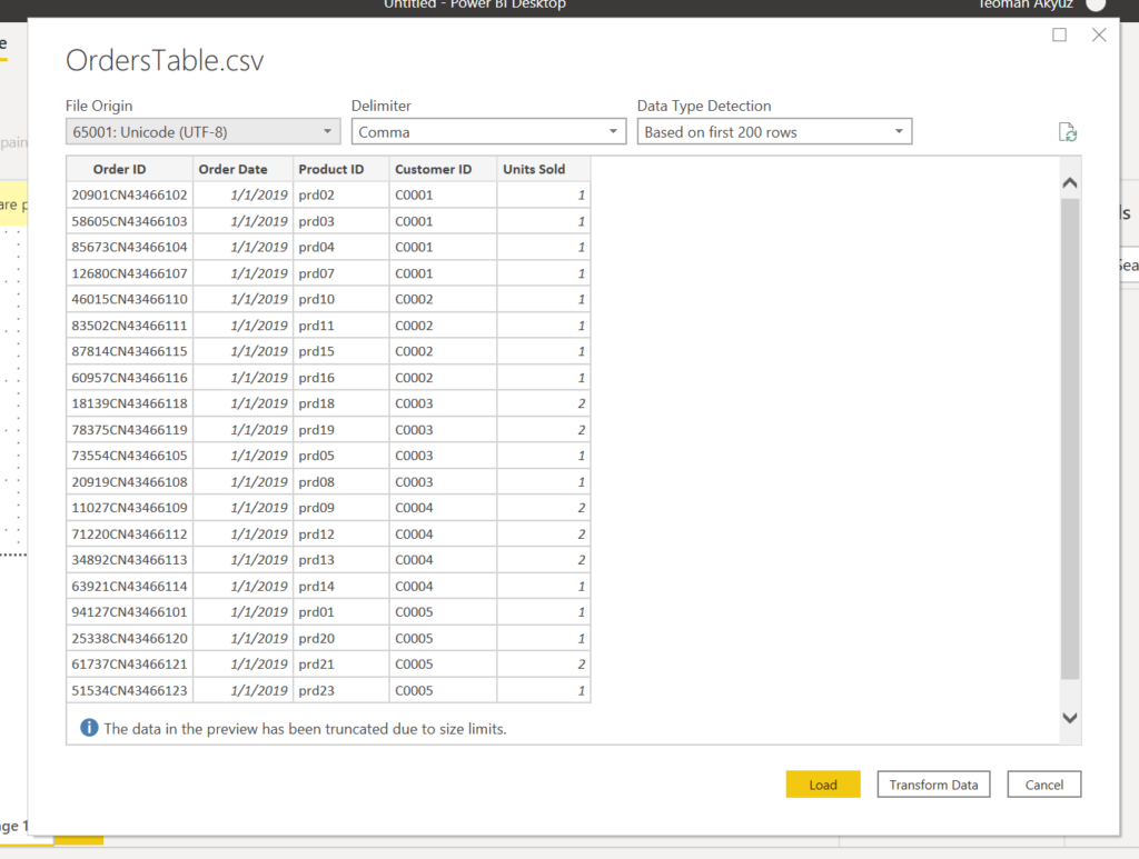
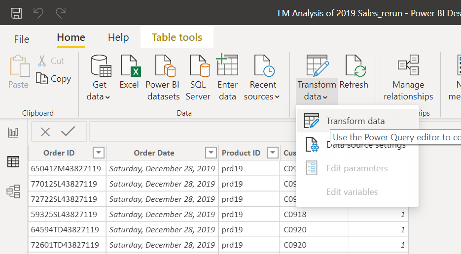
Below you see 3 buttons, Load takes us directly to PBI; in case we need to make some adjustments to data such as column headers, fill empty cells, change data type etc. we have to press Transform Data, which will take us to Power Query (PQ).
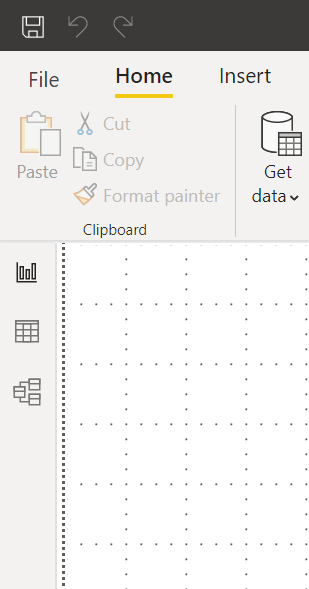
Press load, orders table will be loaded to PBI, and you will land in PBI Report view.
There are 3 views on the PBI desktop, which you can see at the far left of the window, below the ribbon.

The top button shows the Report View, where the results and visualisation are presented on the PBI desktop.
The middle button brings to the Data View. This is similar to Power Pivot Data View. In this view, you can see the tables and make operations on the tables, such as adding columns or measures necessary to perform the analysis.
The last button is for the Model View, which has the same functionality as the Power Pivot Diagram View. You can define table connections and set up database relationships.
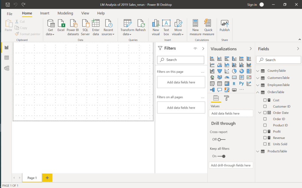
The current view, the Report View, is empty, as we have not prepared any reports or visuals yet. We go to the Data View to examine the table we just loaded.

Let’s have a look also Model View and then go on with loading other tables.

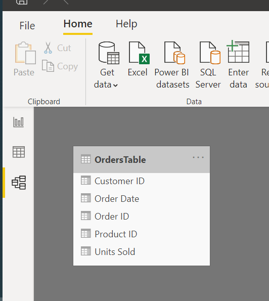
Now load the other 4 tables of the database.
Under the Home, menu select the Get Data tab and select Text/CSV to load the country table.

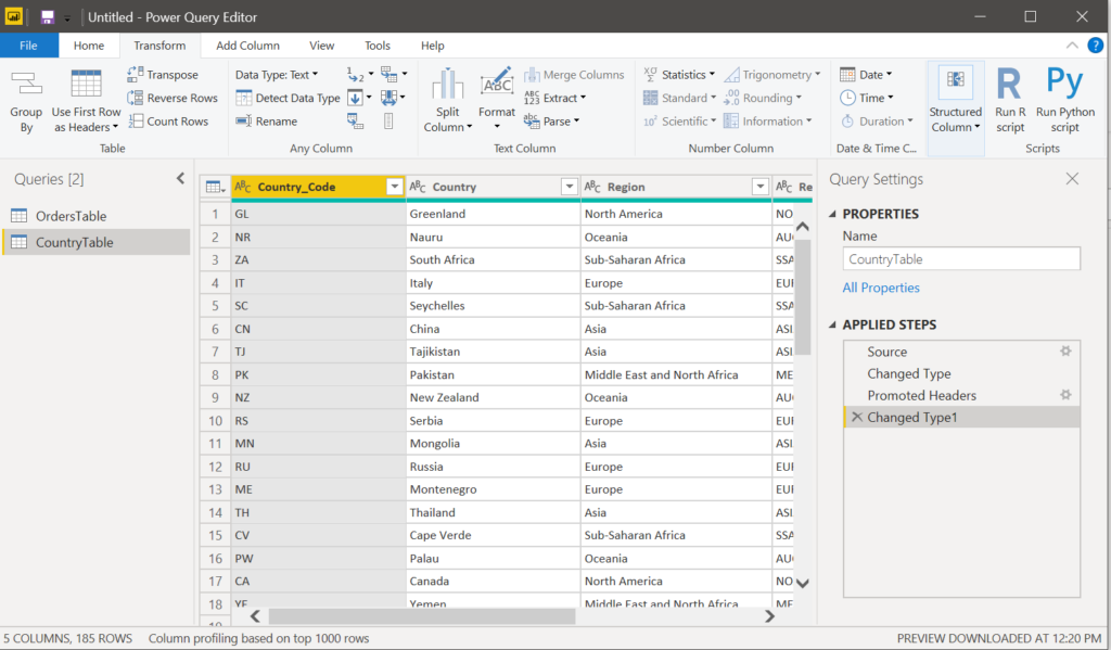
While loading the country table, it is possible that PBI does not recognise the first row as column headers. You have to go to the Power Query to set the first rows as table headers.

In the PQ window under the Transform menu select ‘Use First Row as Headers’ which will correct the headers.

Under the Home menu press Close & Apply; this will take you to Data View in PBI.
Go on and load other tables.
In the model view, you can see 5 tables. PBI has already established the relationships between tables. We have to check if they are aligned with our data model.
Go on to arrange the tables in the best visual order.

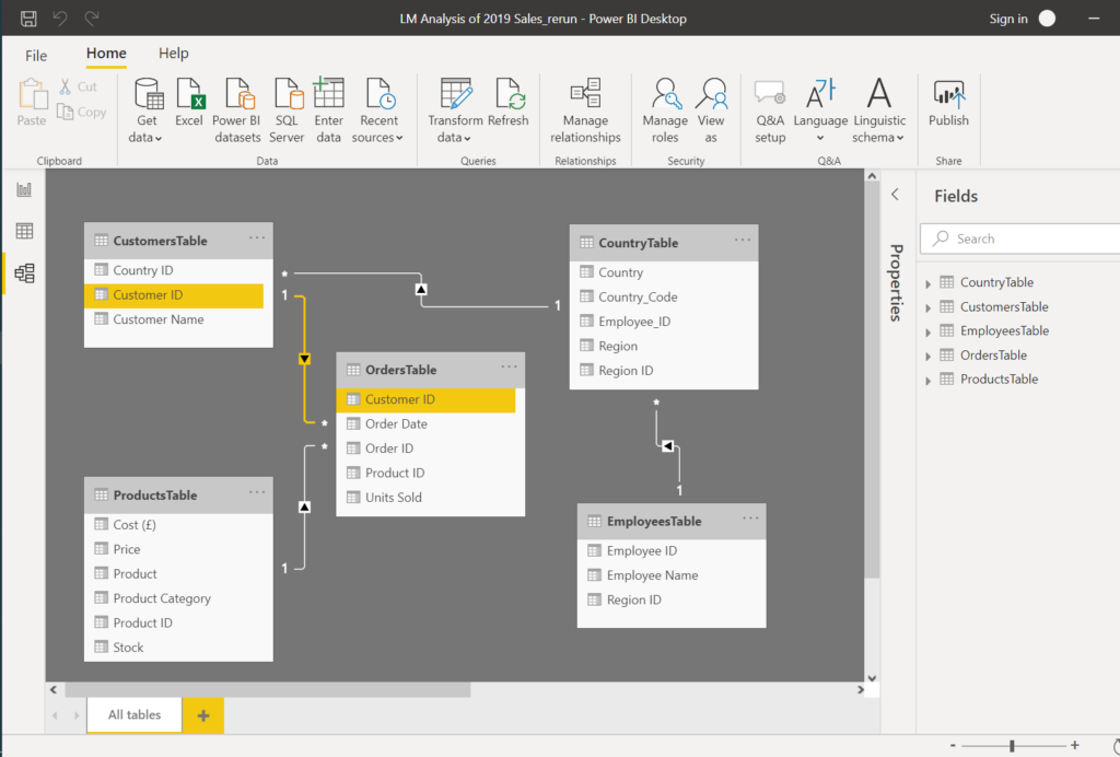
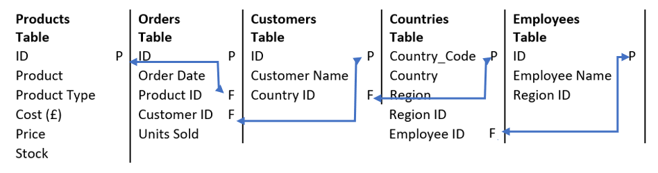
Click any line of an established relationship to check which fields are used for connections, and use the table below to set up the data model with connecting Primary Keys to Foreign Keys.

This is now a good time to save the file we are working on.
On the right of the window, there is the Fields pane in all Views. This pane shows all tables and their columns. You can do some edits on the tables and columns in Model view but we will go to Data View and work on the tables there.
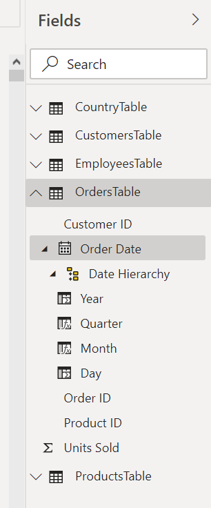
In the data view, we can add columns and measures. We will not add a month column because PBI creates a date hierarchy when it recognises date columns. This enables analysis in desired granularity, daily, monthly, quarterly and yearly.
In the data view under the fields pane, you can see the OrdersTable Order Date column date hierarchy.

We will go on and add the measures we added in Power Pivot.
On the fields pane right-click on the OrdersTable title, you can see the operations you can do over the tables. Select New Measure from the drop-down list (or press the New Measure button on the Table Tools ribbon).

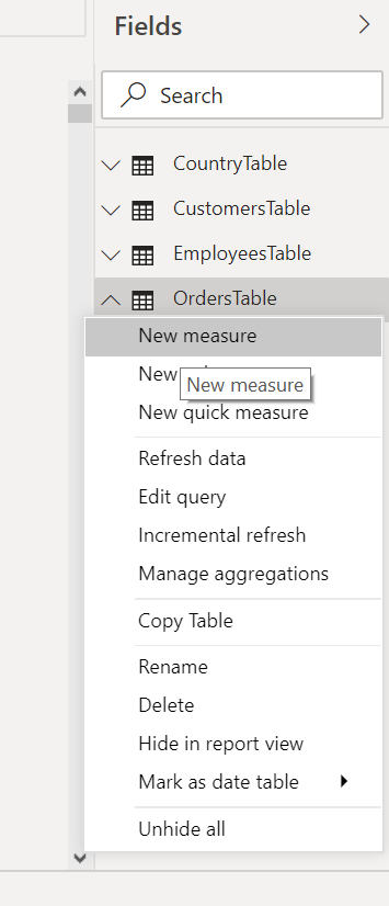
A bar similar to Excel Formula Bar will appear in the window, stating 1 Measure1.
The 1 at the beginning means you are in the first line; you can line multiple lines to execute at one go.
Change the measure name as Cost and write the DAX formula, press enter.
Cost = SUMX(OrdersTable, [Units Sold] * RELATED(ProductsTable[Cost (£)]))

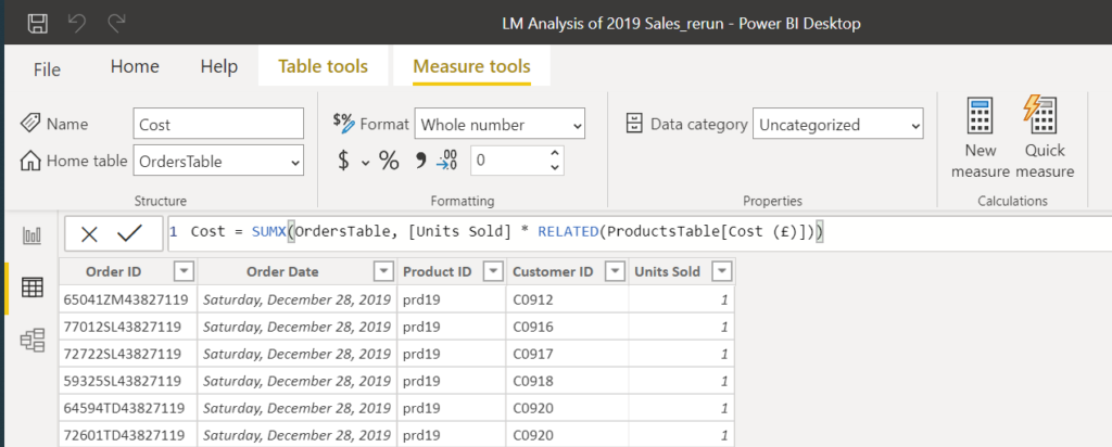
Recognise that this is the same formula that we wrote in Power Pivot in DAX language.
In the Fields pane under the orders table, a new column, ‘Cost’ will appear.
Add formulas for Revenue and Profit.
Revenue = SUMX(OrdersTable, [Units Sold] * RELATED(ProductsTable[Price]))
Profit = [Revenue] - [Cost]
We have now these measures, Cost, Revenue, Profit which you can see under fields pane in all views.
This is all we will do with the tables, and we will now create the Report and answer the below questions.
The Report
Questions
1- What are monthly sales volumes (total units sold, revenue, profit)
2- Regional sales figures (total units sold, revenue, profit)
3- Sales by product (total units sold, revenue, profit)
4- List top 10 countries by revenue
5- Top 100 customers by profit
6- Report top 5 employees who made the highest profits
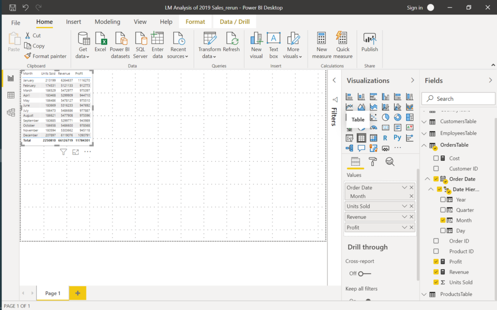
Q1- What are monthly sales volumes (total units sold, revenue, profit)
Go to the report view. You will see the blank report canvas and Filters, Visuals and Fields panes.
We will choose the visuals we want to include in our report, then add fields by checking the fields of the tables in the Fields pane and use filters to display the records we are looking for.

To work in a wider space on the report, click on the small arrow and collapse the Filters pane.
To answer the questions, we will only use Table visualisation, which resembles a Pivot Table.
Add Table, and a blank Table will be added to the report, then choose Month, Units Sold, Revenue and Profit fields from the orders table.
All other tables will be added with the same steps.
Q2- Regional sales figures (total units sold, revenue, profit)
Add another Table visual, select Region field from the country table, Units Sold, Revenue and Profit fields from the orders table.
Q3- Sales by product (total units sold, revenue, profit)
Add a Table, select Product field from the products table, Units Sold, Revenue and Profit fields from the orders table.
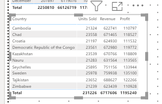
Q4- List top 10 countries by revenue
Add a Table, select Country field from the country table, Units Sold, Revenue and Profit fields from the orders table.
Now expand the Filters Pane, expand the Country Filter, select Filter Type ‘Top N’, in Show Items select ‘Top’ and write 10, drag & drop Revenu column into By value field. Press Apply filter.

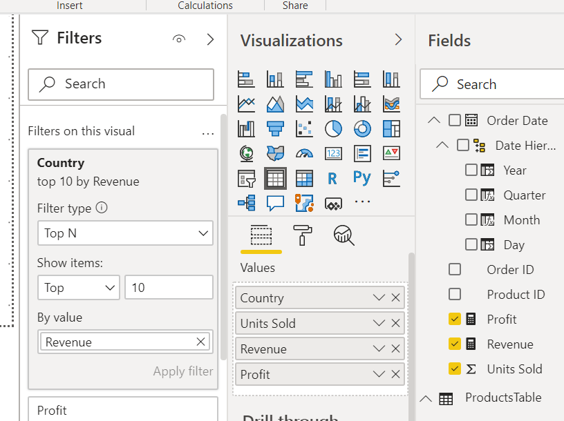
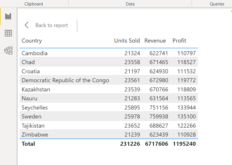
Click the Focus Mode button (one of the 2 buttons which appears when the table is selected), examine the country table.


Q5- Top 100 customers by profit
Add another Table visual, select the Customer Name field from the Customers table, Units Sold, Revenue and Profit fields from the orders table.
Add filter for top 100 customers by profit.
Q6- Report top 5 employees who made the highest profits
Add Table visual, select Employee Name field from the Employees table, Units Sold, Revenue and Profit fields from the orders table.
Add filter for the top 5 employees by profit.
After finalising all the tables make sure to resize the tables and set them on the report for best viewing, rename Page 1 (at the bottom) as ‘Sales Report’.
The tables in the report are connected and can be used as filters.
Remove the filters from Country, Customers and Employees tables and collapse all tabs on the left for best viewing. Click on September at the Months table: All the tables in the report now show September 2019 results.
All the tables are showing the September results.

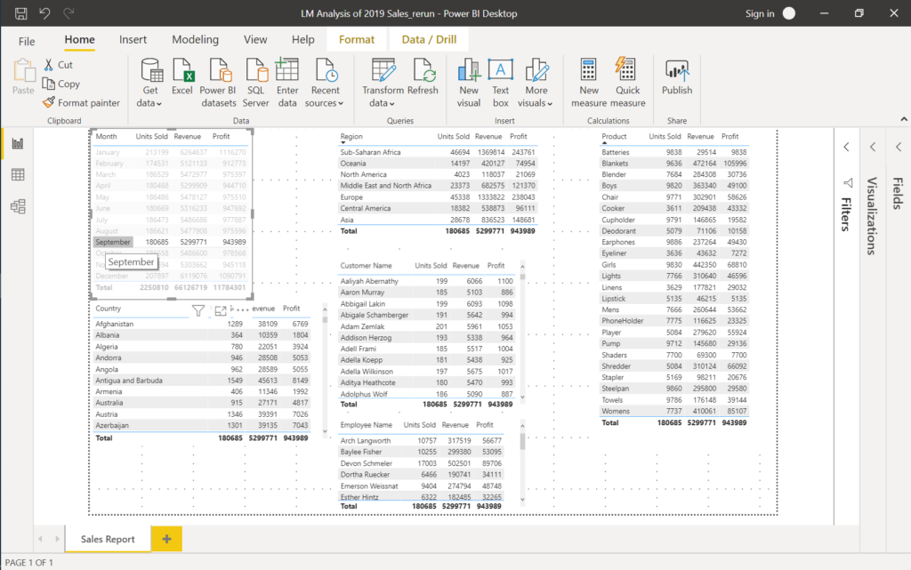
All other tables in Sales Report are filtered to show September 2019 results
The report shows the results for September 2019: Sales to all countries in all regions, sales by each product purchase by all customers, the performance of all employees for the month of September.
Recognise that the totals of all the tables are equal to totals of month September in Month table.
Let’s examine a customer’s profitability: Select Abbigail Lakin in the customers table.

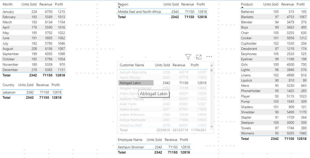
A customer belongs to one country, in one region and has one employee dealing with his/her account
The filtered tables only show the rows with data.
Abbigail Lakin is from Lebanon in the MENA region and has bought 2.342 units of products paying £71.150. Employee Keshaun Stroman is responsible for Abbigail’s account, and LM made a profit of £12.818 in 2019 from him. The monthly purchases Abbigail Lakin and the details of purchases of all products can be examined from relevant tables.
Click the Total in the Customers table the reset the filter.
And go on to prepare the Dashboard.
The Dashboard
In the Power BI desktop version, we can create reports with various visuals. We will now create another report which shows the visuals we prepared in the Excel dashboard.
Right-click on the report name and select Duplicate Page. Rename the new page as Sales Dashboard. The visuals can be changed by selecting any other visual in the Visualisations tab that is proper to display the data in the current visuals, and because of this flexibility, we start with the report we have prepared already.
Select the month table in the report and select the Slicer visual from visualisations.

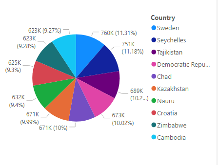
Select the Country table, remove the units sold and profit fields, set the filter to Top 10 by revenue again and select Pie Chart visual.

Select the Employees table, remove units sold and revenue fields, set the filter to Top 5 by profit and select Clustered bar chart visual.


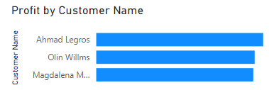
Select the Customers table, remove units sold and revenue fields, set the filter to Top 5 by profit and select Clustered bar chart visual.

We will leave the Region and Products as tables and add new visuals.
Click on an empty space in the Sales Dashboard and add a map visual. Add the country field from the country table and units sold field from the orders table.
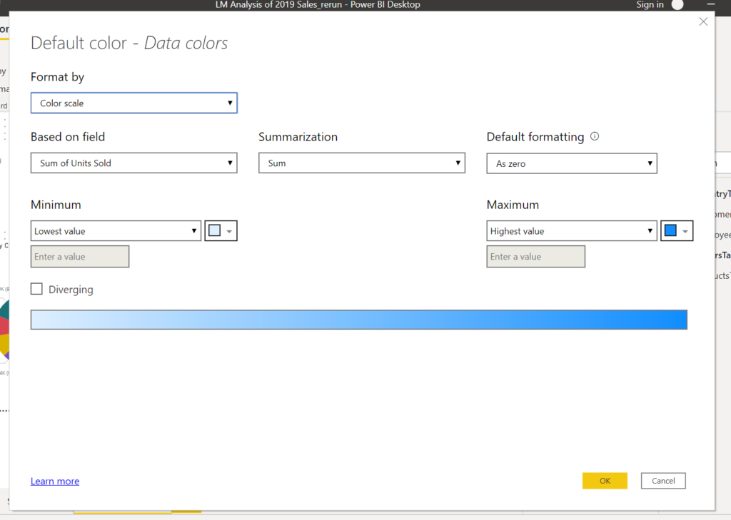
On the Visualization, pane click on the Format button. Expand Data colours and set Show all sliders to on.


Press the fx button and set Based on the field to Units Sold, Summarization to Sum, Default Formatting As zero and press OK.

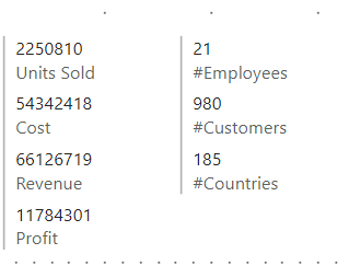
Add a Multi-row card visual and add Units Sold, Cost, Revenue and Profit from the Orders table.
We will also add number of customers, countries and employees. Fo these we will add measures.
In the Modeling menu click on the New Measure button and add
#Employees = COUNTROWS(VALUES(EmployeesTable[Employee Name]))
#Customers = COUNTROWS ( VALUES ( CustomersTable[Customer Name] ) )
#Countries = COUNTROWS ( VALUES ( CountryTable[Country] ))
Add another Multi-row card and add#Employees, #Customers and #Countries. These measures are created under one of the tables you were examining.

Finally, we need to add a Title for our dashboard.
Add a Textbox from the Home menu ribbon, write a title and colour it as you wish.
Move and size the visuals for the best view, and the dashboard is ready.

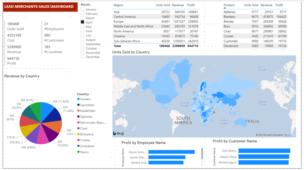
You can click on the visuals, slider, tables, chart and map, to analyse the results on the dashboard.
We will go on to prepare a Flat-File, which is a summary database of the Lead Merchants database tables.
The Flat File
We will prepare a Flat-File which is much smaller than the original database to use in Excel for reporting.
We will use Power Query, prepare a new table from existing tables and then copy this table to Excel.
Open Power Query from PBI home menu transform data button.

Here we will create a new table by merging columns from existing tables. We can merge 2 tables in one shot so we will have to do the merge process 4 times, to get all the necessary columns.
On the Home menu in PQ click Combine > Merge Queries > Merge Queries as New

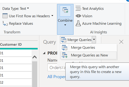
In the Merge dialogue Select Orders Table and Products Table, select Product ID columns for the link between these 2 tables and press OK.

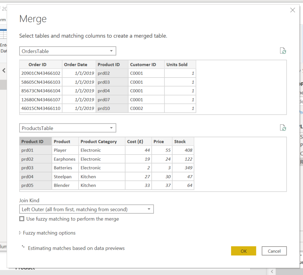
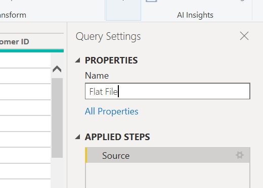
Now we have a new table named Merge1, rename under Query Settings Properties as Flat File.

We will again merge, but this time not as a new query
Combine > Merge Queries > Merge Queries

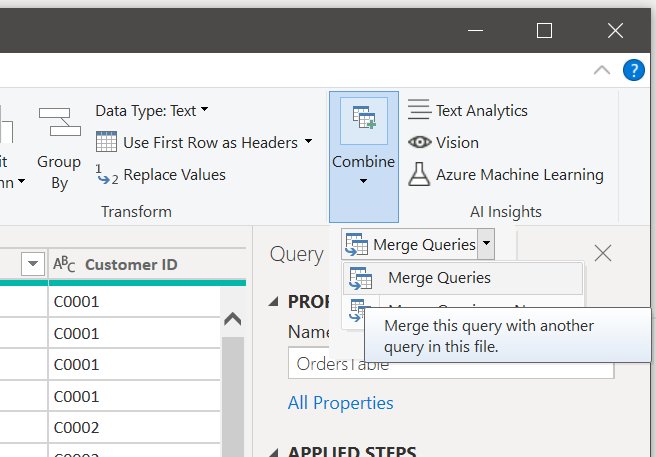
This time merge the new table Flat File with Customer table taking all columns except customer ID (this already exists in Flat File.
Do the merge for the Country and the Employee tables. You have to show connections each time and exclude already existing columns.
We have to delete the Order ID column and change the date to month.
Right-click on the Order ID column and select Remove from the drop-down list.
Then under the Transform menu select Date > Month > Month.

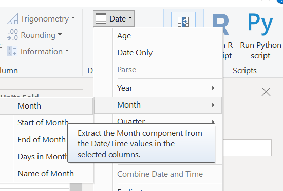
Rename the column as Month.
We have one more step; we must group the table.
Under the transform menu, press the Group By button.
Click Advanced, add all columns for grouping except Units Sold, Price and Cost columns. We will aggregate the Units Sold column and add calculated columns for revenue and cost.
Add Units Sold as a new aggregation column, select Sum operation. Press OK.

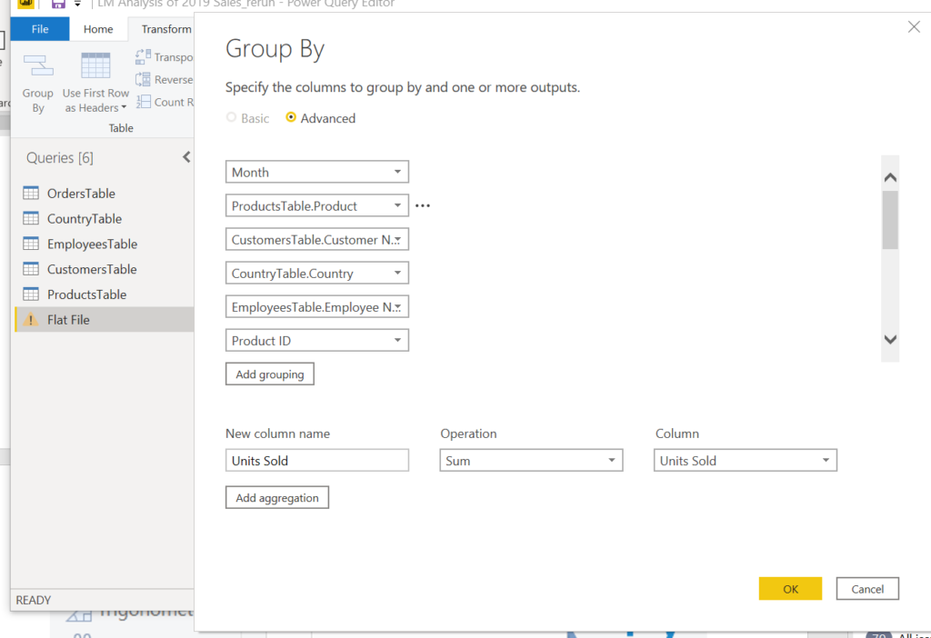
We will group the recurring rows of the table and take sum of the column with numeric values (Units Sold).
Press the Close & Apply button under the Home menu, we land in the PBI window. We have a flat-file of 229.560 rows and one header row.
We will now add the Revenue and Total Cost columns.
First, we will delete the Price and Cost columns; on the fields pane click on the three dots, select Delete on the drop-down list. Do this for both columns.
Under the Table Tools menu select New Column, at the formula bar write below formula:
RevenueF = 'Flat File'[Units Sold] * RELATED(ProductsTable[Price])
Add another column for cost:
CostF = 'Flat File'[Units Sold] * RELATED(ProductsTable[Cost (£)])
Right-click on the month column and select the Copy table.
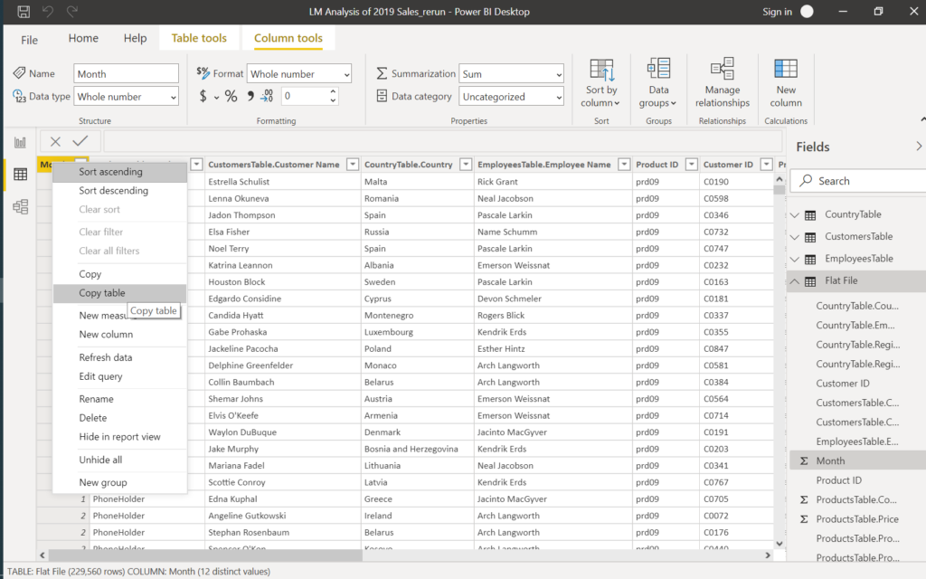
Paste the table to an empty Excel workbook to go on with the Analysis, Reporting, Visualisation with EXCEL.
Next, we will explore the Power BI service, distribute our reports online over the internet and mobile devices, have a look at the AI and connection to systems for automation.