The Dashboard
In the Power BI desktop version, we can create reports with various visuals. We will now create another report which shows the visuals we prepared in the Excel dashboard.
Right-click on the report name and select Duplicate Page. Rename the new page as Sales Dashboard. The visuals can be changed by selecting any other visual in the Visualisations tab that is proper to display the data in the current visuals, and because of this flexibility, we start with the report we have prepared already.
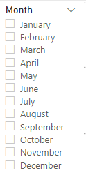
Select the month table in the report and select the Slicer visual from visualisations.
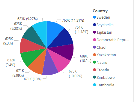
Select the Country table, remove the units sold and profit fields, set the filter to Top 10 by revenue again and select Pie Chart visual.
Select the Employees table, remove units sold and revenue fields, set the filter to Top 5 by profit and select Clustered bar chart visual.

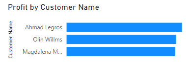
Select the Customers table, remove units sold and revenue fields, set the filter to Top 5 by profit and select Clustered bar chart visual.
We will leave the Region and Products as tables and add new visuals.
Click on an empty space in the Sales Dashboard and add a map visual. Add the country field from the country table and units sold field from the orders table.
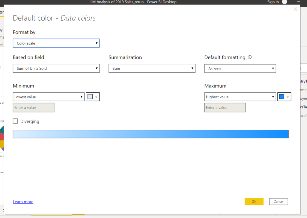
On the Visualization, pane click on the Format button. Expand Data colours and set Show all sliders to on.

Press the fx button and set Based on the field to Units Sold, Summarization to Sum, Default Formatting As zero and press OK.
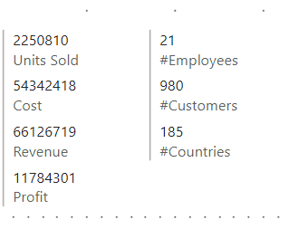
Add a Multi-row card visual and add Units Sold, Cost, Revenue and Profit from the Orders table.
We will also add number of customers, countries and employees. Fo these we will add measures.
In the Modeling menu click on the New Measure button and add
#Employees = COUNTROWS(VALUES(EmployeesTable[Employee Name]))
#Customers = COUNTROWS ( VALUES ( CustomersTable[Customer Name] ) )
#Countries = COUNTROWS ( VALUES ( CountryTable[Country] ))
Add another Multi-row card and add#Employees, #Customers and #Countries. These measures are created under one of the tables you were examining.
Finally, we need to add a Title for our dashboard.
Add a Textbox from the Home menu ribbon, write a title and colour it as you wish.
Move and size the visuals for the best view, and the dashboard is ready.
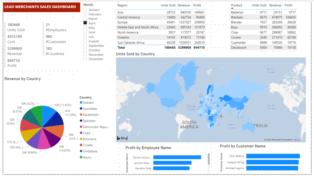
You can click on the visuals, slider, tables, chart and map, to analyse the results on the dashboard.
We will go on to prepare a Flat-File, which is a summary database of the Lead Merchants database tables.