


SQL is fast to answer questions on data; it is quite useful to pull quick insights. When you need to do calculations on the results and present in special formats, Excel is the tool you are looking for.
Excel is among the most powerful tools for bespoke reporting and analysis. But it has some limitations: there is a limit to the data you can load and analyse at one shot, around a million lines. Even if your data is much less than a million lines when you work on complicated reports such as the balance sheet ageing report, Excel gets slower and slower.
The world has been changing towards digitalisation, and data is now coming in massive amounts. Data analysis is evolved into a science in its own right and so the tools used for analysing data. MS Excel caught up with this evolution with Power Pivot.
Power Pivot was first presented in 2010, and it has been evolving into a much practical and more robust tool over the last decade. Power Pivot implements the features of database software such as database tables and relationships, adds its calculation engine with a language designed explicitly for analysis over Power Pivot, the Data Analysis Expressions (DAX), and reports analysis results with pivot tables and visualisations such as dashboards.
We will start our analysis with loading Lead Merchants Sales Database tables to Power Pivot and set relationships between these tables. Then we will answer our questions with the analysis of the sales database with Pivot Tables, and we will prepare the same dashboard we developed in classic Excel.
For most of us, the very point of using Excel is preparing bespoke reports for our business needs. Power Pivot limits us performing analysis with pivot tables. We can gather any information over the data we are analysing, but we can not put the results in our desired format with pivot tables. Also performing calculations with classic Excel methods and functions are not practical with pivot tables.
So as a final step, we will prepare the flat file we previously have arranged with SQL to use in classic Excel, but this time with Power Pivot.
You can download the Power Pivot workbook used for our analysis from the link below. If you want to follow the workshop performing the step-by-step instructions yourself, you can find the Lead Merchants Database tables here.
Now let’s start our analysis. We will start with the Power Pivot, then the Dashboard and we will also prepare the Flat File we have previously made in SQL to work on classic Excel.
The Power Pivot
Power Pivot comes with all versions of Excel starting from 2019; some earlier versions require download. Power Pivot comes as an add-in which you must activate to start using Power Pivot.
Go to File > Options > Add-ins > Manage select COM Add-ins press go, and check the box ‘Microsoft Power Pivot for Excel’


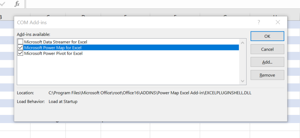
Now you have Power Pivot Menu on main Excel window ribbon.


Press Manage button to go to Power Pivot window.
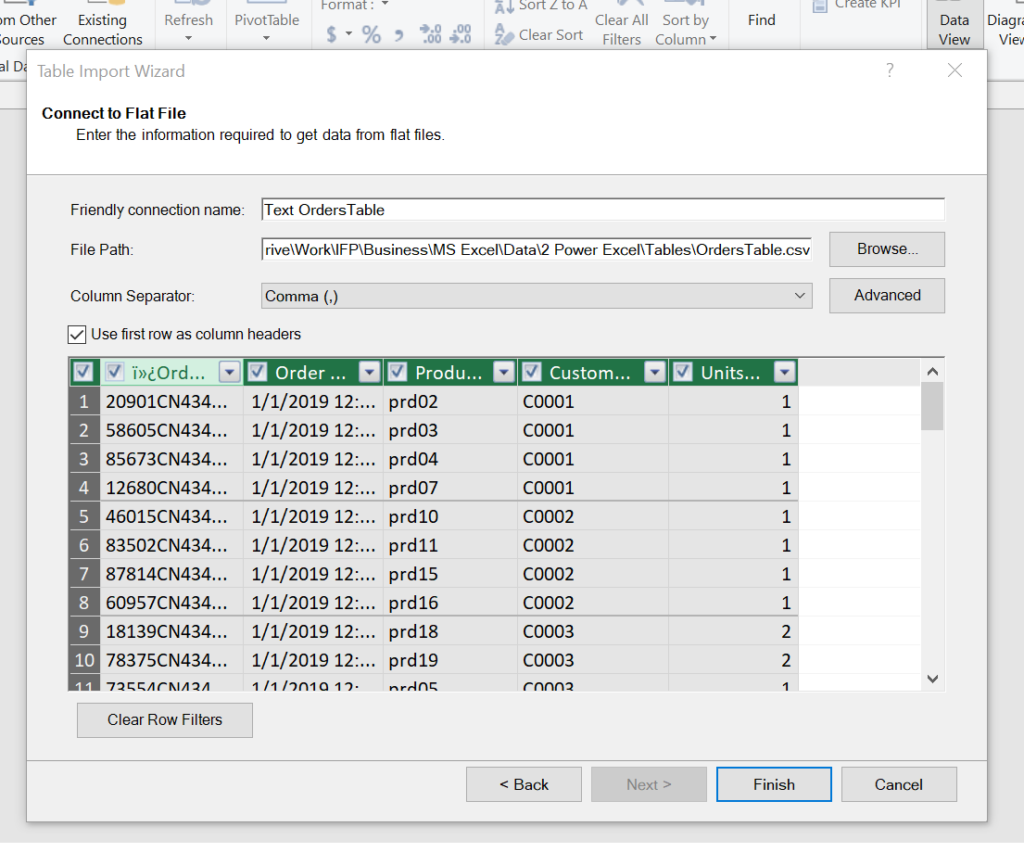
In this window, we will do the database set-up and design. We will first do the ETL (Extract, Transform, Load) operation.
From Home > From Other Sources > select Text file to load our csv files and press Next button.


Browse for the OrderTable.csv file, make sure to check the ‘Use first row as column headers’ and press Finish.

It will take a short while to load all 2 million lines. Press Close.


Follow the same steps to load the other 4 tables of the database. Power Pivot will take you to data view after loading each table.

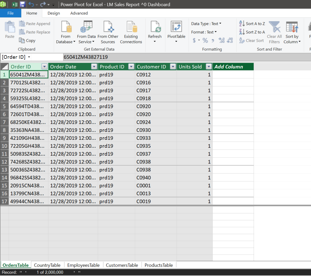
After loading all tables, go to Diagram View.


In the Diagram View create connections between tables; between Primary Keys to related Foreign Keys of other tables.


Simple drag and drop of one key in a tablet o related key in another table establishes the connection.
Drag and drop each table on the view to set the best view of the database schema. Then create all connections between tables. Below is the relationships between the tables.


After creating all relationships, we will go back to Data View to add some formulas to get our tables ready for analysis.


Setting these relationships makes the analysis possible on the data contained in all sheets. The 2 graphics below show 2 pivot tables displaying total units sold by each employee, before and after establishing the connections.

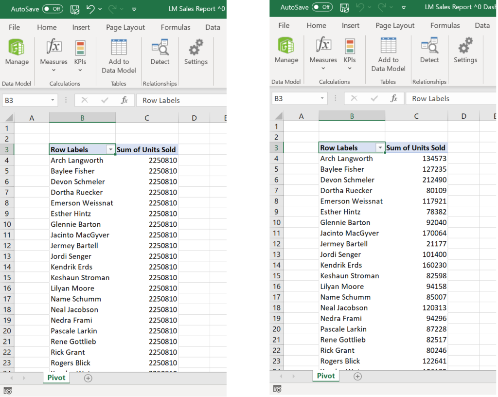
Right: The pivot table with relationships set performs the calculation for the number of products that each employee has sold
With the connections set, we can analyse the data that is already included in the tables. But we will need more for our analysis, we have to perform calculations such as revenue, total cost and profit, and also we must extract month from date information.
We can do all on the pivot tables by adding calculated columns or adjusting display for the month view, but the best way to perform and later improve the calculations is to work on the Data view.
We can add columns to any table or add formulas which their results will be displayed as columns in pivot tables. The formulas in Power Pivot called measures. They are written using DAX language.
The columns of a Power Pivot table are database table columns. All the cells in a column will have the same type of data. A formula entered into a column will spread to all cells in that column.
Excel is originally in tabular form and a cell-based spreadsheet tool. So each cell can have a different formula and different type of data. In Power Pivot we work with tables.
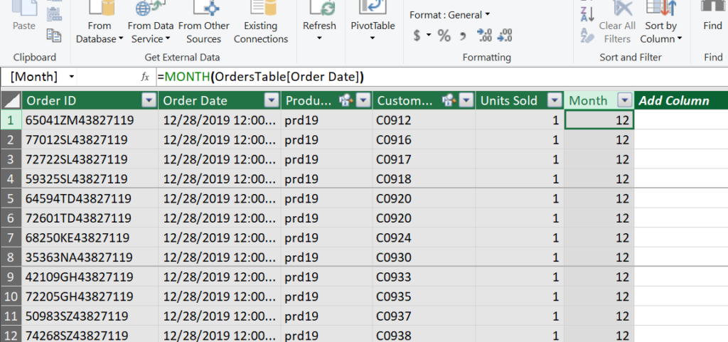
We add a column to orders table for month column:
=MONTH(OrdersTable[Order Date])
When we write this formula and press enter, the whole column gets the same formula. This formula reads the order date column and returns the month value. This is calculated for every row of the table.
Rename the column as month.

We will then add measures for the total units sold, total cost, total revenue and profit. These measures can be added on the Excel worksheet when the pivot tables are created, but having them on the data view is a more preferred way because some analysis can be done directly on this page.
When you enter the formulas for measures Power Pivot automatically names them as Maesure1, Measure2 and so on and you must rename them for ease of use later in the pivot tables.
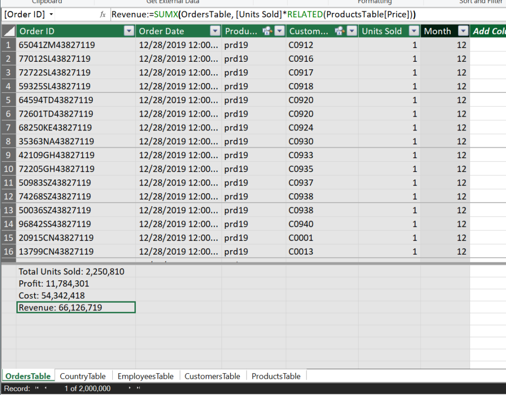
Total Units Sold:=[Sum of Units Sold]
Cost:=SUMX(OrdersTable, [Units Sold]*RELATED(ProductsTable[Cost (£)]))
Revenue:=SUMX(OrdersTable, [Units Sold]*RELATED(ProductsTable[Price]))
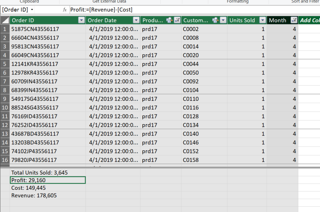
Profit:=[Revenue]-[Cost]

Bottom: the measures are seen in the Calculation Area
These measures show the totals for the moment, but they work with the filtered context of the tables they are performing calculations. Recognise the filter buttons on the header of orders table; they are all set to default, show all.
We want to see the total sales results of product 17 in the month of April. We will set the filters for that.

We are ready to begin our analysis. We will answer the same questions with pivot tables.
Questions
1- What are monthly sales volumes (total units sold, revenue, profit)
2- Regional sales figures (total units sold, revenue, profit)
3- Sales by product (total units sold, revenue, profit)
4- List top 10 countries by revenue
5- Top 100 customers by profit
6- Report top 5 employees who made the highest profits
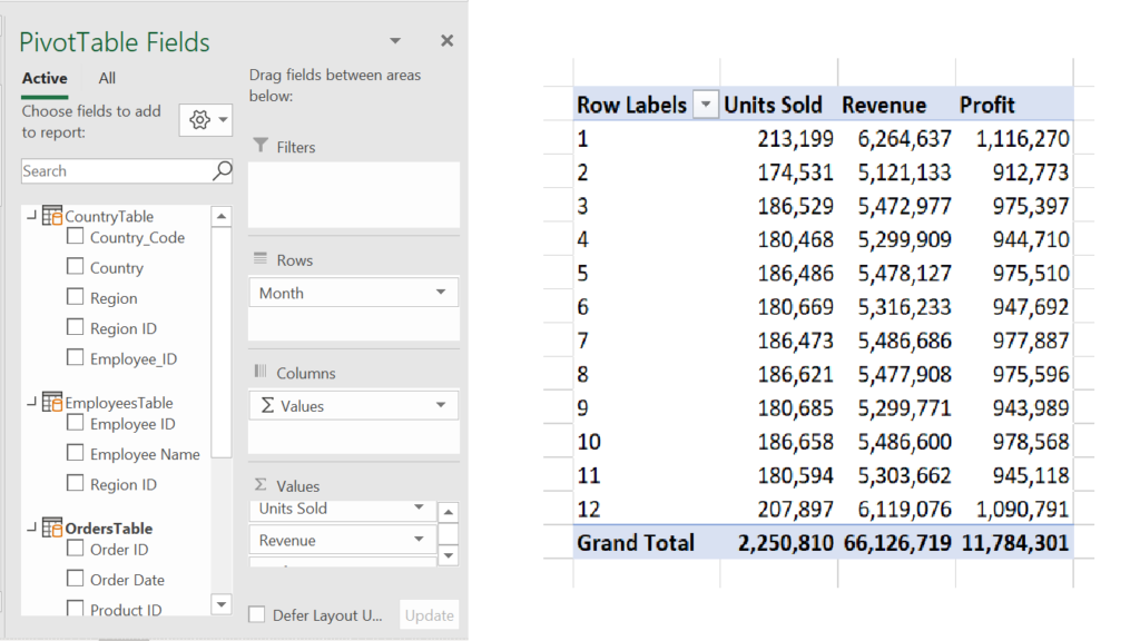
Q1- What are monthly sales volumes (total units sold, revenue, profit)
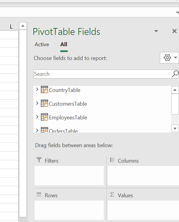
Press the Pivot Table button, select a new sheet; you’ll land on Excel into an empty pivot table.

Analyse the pivot table fields, you’ll see that all the tables in our Power Pivot are here.

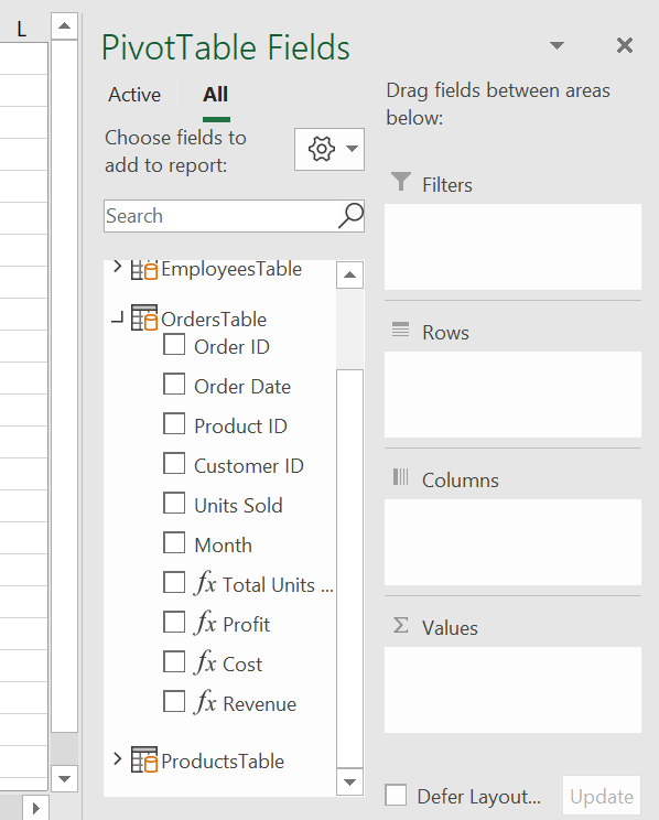
Click on the arrow pointing the Orders Table to see its columns. As you can see besides the original table columns, there are the calculated column and the measures as columns.

For our first question, we will put the month in rows and Units Sold, Revenue and Profit under Values field as SUM. Format the pivot table totals as numbers (see The Pivot) and change the column headers as you wish. The first Pivot table is ready.

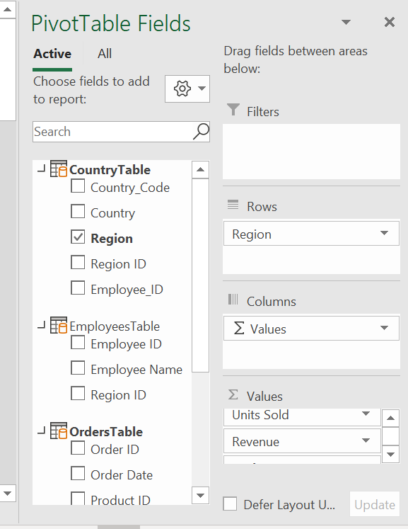
Q2- Regional sales figures (total units sold, revenue, profit)
For all other questions first, we will copy the monthly figures pivot table and change the Rows field.
For regional sales, put regions column from CountryTable to the Rows field.

Q3- Sales by product (total units sold, revenue, profit)
For sales by product, put product column from ProductsTable to the Rows field.
Q4- List top 10 countries by revenue
For the top 10 countries, put country column from Country Table to the Rows field. Then filter to display top 10 and sort with descending order on revenue (see The Pivot for instructions filter and sort).
Q5- Top 100 customers by profit
For the top 100 customers, put Customer Name column from Customers Table to the Rows field. Then filter to display top 100 and sort with descending order on profit column.
Q6- Report top 5 employees who made the highest profits
For the top 5 employees, put the Employee Name column from Employees Table to the Rows field. Then filter to display top 5 and sort with descending order on profit column.
The pivot tables are complete for the answers to our questions. For analysis, we can add a timeline to our spreadsheet.
Select and pivot table, from PivotTable Analyse menu, select Insert Timeline. In the timeline box select Quarters as period, set the timeline in a convenient place in the spreadsheet.
You have to set the connections of the timeline, as we did for slicers in The Pivot. Right-click on the timeline, select Report Connections and check all pivot tables in the Pivot sheet in the dialogue box.

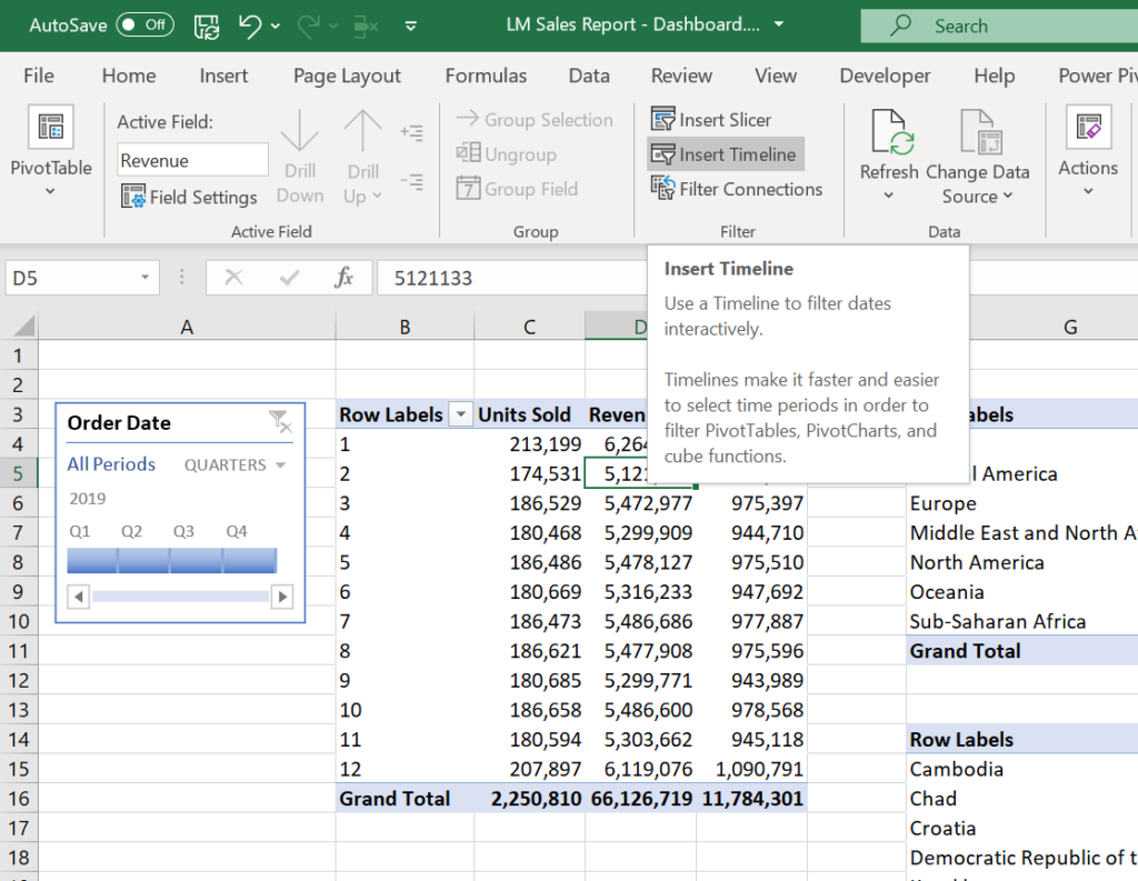
Examine the results by playing the quarters.
The Dashboard
We will prepare the same dashboard as we did in Analysis with Excel. You must follow the same instructions from The Dashboard we made earlier. I will not repeat the instructions here, but I will explain minor changes to replace the formulas we used in the previous dashboard.
In the previous dashboard, the Total Sales table figures were calculated by formulas referencing to the flat table. As we are working with Power Pivot now, we do not have any data on a spreadsheet we could use to reference formulas. In Power Pivot, we can write measures, or we can create pivot tables.

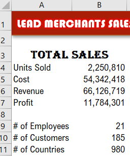
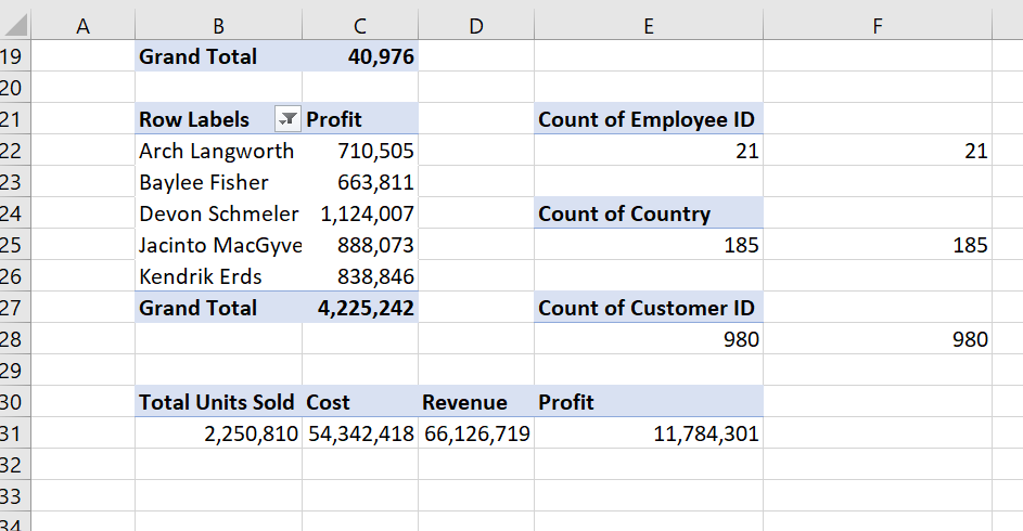
Unhide the Dashboard Tables sheet to see the added Pivots to replace these formulas. As you can see, we added a pivot table taking sums of Units Sold, Cost, Revenue and Profit. And we also added 3 pivot tables for counting the Employees, Customers and Countries.

Link the results to The Dashboard Total Sales table.
These were enough for our purpose, but in case necessary, we could use a distinct count function on all tables in Power Pivot Data view.
See the DISTINCTCOUNT measure in CustomersTable.
#_of_Customers:=DISTINCTCOUNT(CustomersTable[Customer Name])
The Flat File
I already mentioned that the best use of Excel for me is its power on bespoke reporting. Designing spreadsheets by using formulas infinitely different ways allows preparing and automating any report, analysis, presentation you need. While Power Pivot allows you to analyse huge amounts of data in very efficient ways, the reporting and presentation capabilities are not comparable (currently) to classic Excel.
And we already argued the limitations of classic Excel. We started this workshop with SQL; we performed the analysis with SQL, but the real reason we used SQL was to summarise the data and prepare a flat-file so that we could use in classic Excel.
Power Pivot also allows us to prepare a flat file, which has not much use for Power Pivot but it is almost as good as SQL if you want your data summarised and flattened so that you can use in Excel in your old ways.
So let’s start with preparing our flat table.
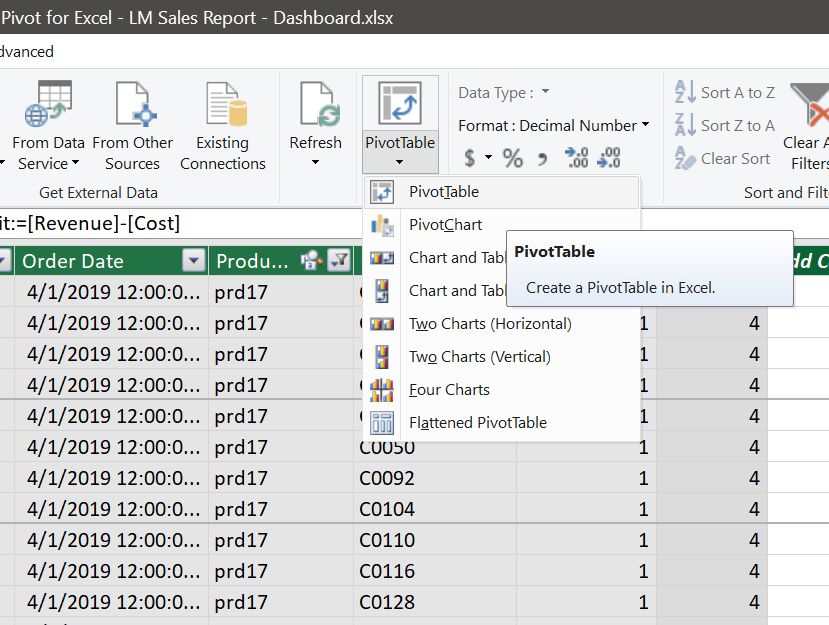
In the Power Pivot Data view Home menu, PivotTable tab select Flattened PivotTable.

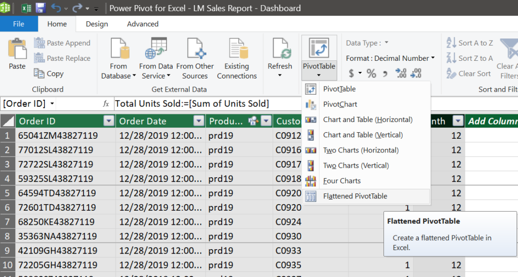
Click on the new sheet, and you will land in Excel with an empty pivot table. We will use fields from all tables for our flattened table.

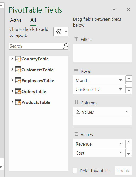
Select the columns below and put under Rows field of the pivot table (one column at a time).
You can also click near the boxes of the columns you want to add which is much easier. Beware that there is a stability issue here about Excel recognising some of the tables active and some of them (Country Table and Employees Table) inactive in the outset. The inactive tables’ columns tend to populate/branch, like normal pivot table columns, which means exponentially increasing the number of columns besides resulting in our table not being flat.
So go on and drag and drop at the given order. But do not worry about the order too much; you can change the order later by moving the columns up and down in the Rows field.
| Rows Field | |
| Table | Column |
| OrdersTable | Month |
| CustomersTable | Customer ID |
| CustomersTable | Customer Name |
| ProductsTable | Product Category |
| ProductsTable | Product ID |
| ProductsTable | Product |
| CountryTable | Country |
| CountryTable | Country ID |
| CountryTable | Region |
| CountryTable | Region ID |
| EmployeesTable | Employee ID |
| EmployeesTable | Employee Name |
| Values Field (Sum) | |
| Table | Column |
| OrdersTable | Total Units Sold |
| OrdersTable | Revenue |
| OrdersTable | Cost |
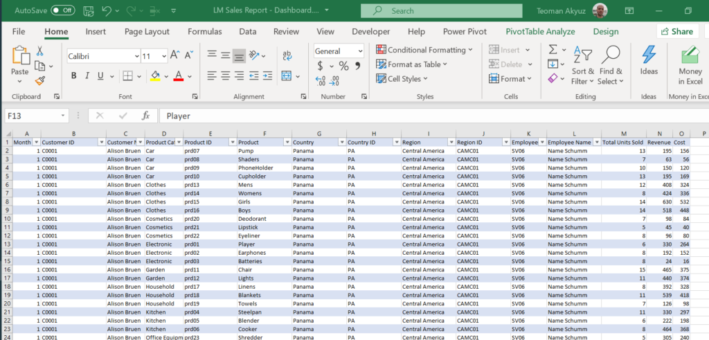
Below is an extract from our flat table ready to use to perform Analysis, Reporting, Visualisation with EXCEL. Check the file and recognise that the flat table is exactly 229.561 rows, so as the file we pulled from the same database with SQL.

Next: we will go on with Power BI, a new tool for data analysis and business intelligence.