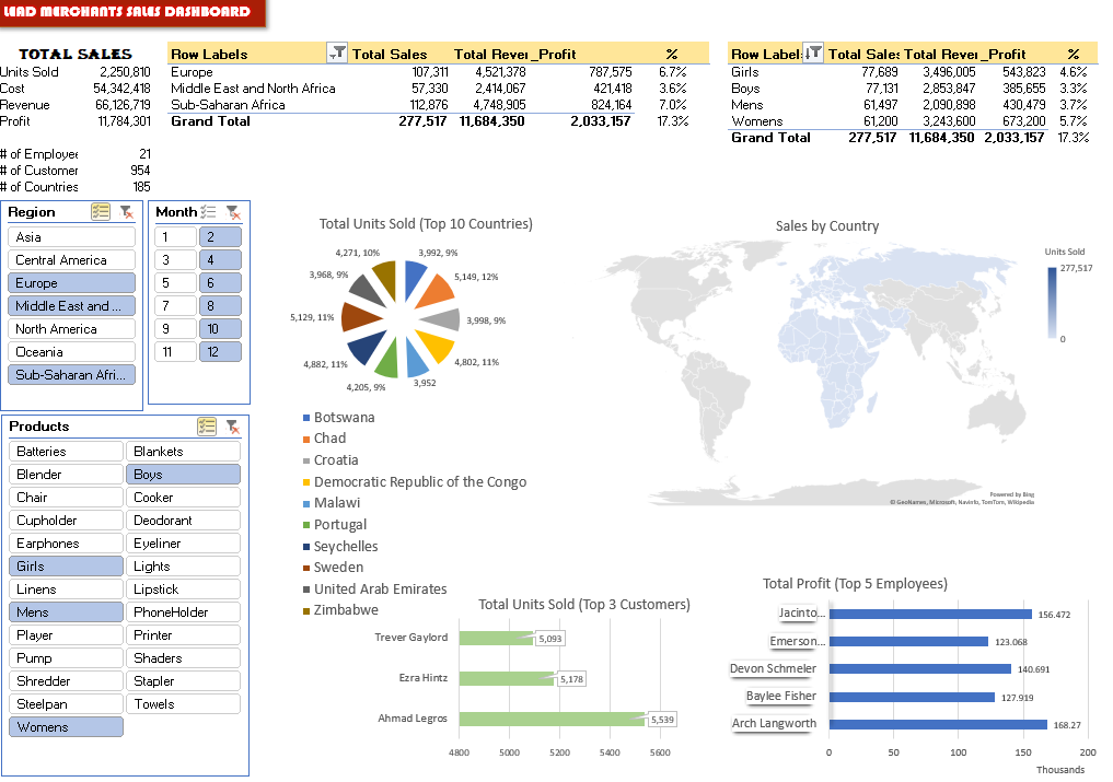
The Dashboard
This is where visualisation happens. We will present the results of our analysis with numbers, percentages, graphs and other visuals.
Create a new sheet, name it Dashboard.
The first table is the total sales (cells A3:B11), which presents overall information on Lead Merchants 2019 sales. Prepare it with the below formulas:
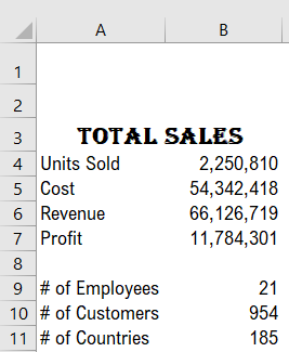
Units Sold B4=SUM(_SU)
Cost B5=SUM(_SC)
Revenue B6=SUM(_SR)
Profit B7= Revenue - Cost
# of Employees  B9=COUNTA(UNIQUE(_ENA)) – the
filter context of dynamic array formula UNIQUE
is used in count function
# of Customers B10=COUNTA(UNIQUE(_CUNA))
# of Countries B11=COUNTA(UNIQUE(_CN))
Set new name - Cell B7= _Profit
Now we will add pivot tables:
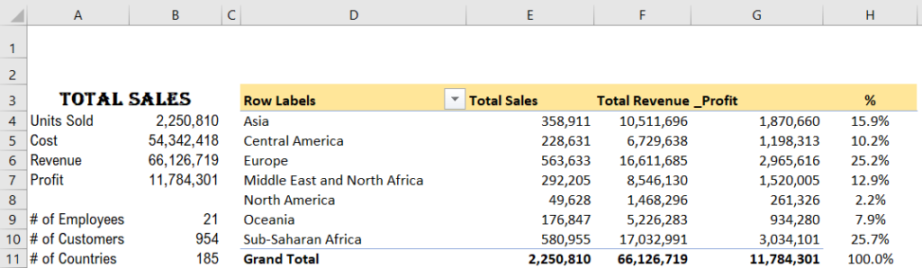
Copy the regions table from the Pivot sheet and paste it to cell D3.
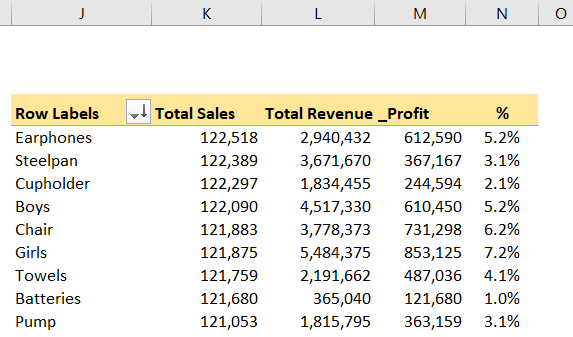
In cells H3:H11, near the regions table, we put a new one-column table with formulas. This is the percentages table. It reads the profit numbers from the regions pivot table and divides it to the total profit of the year (cell B7).
Cell H4 =G4/_profit
Copy this cell up to cell H11.
Colour the cells D4:H4 yellow, setting the display as one table.
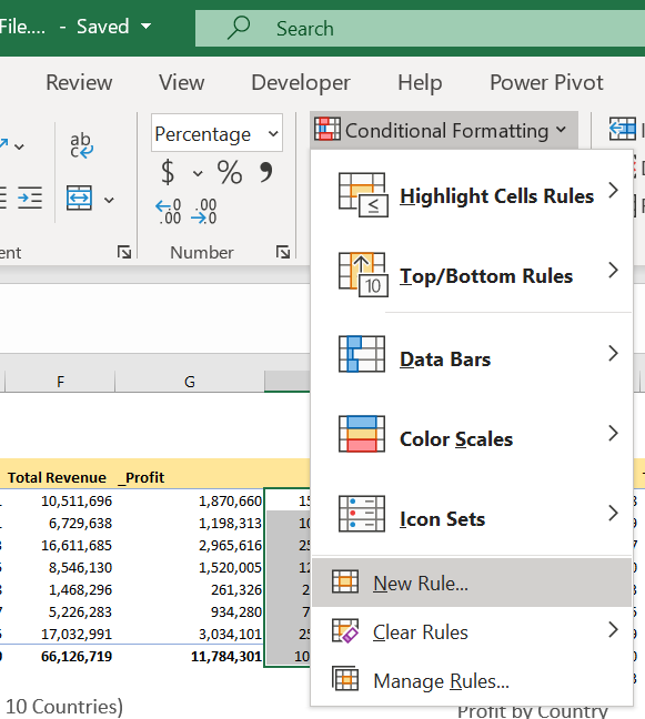
We will also set conditional formatting to cells H4:H11, to make them invisible in case there is no value in the pivot table’s corresponding cell in column G.
Select Home > Conditional Formatting > New Rule.
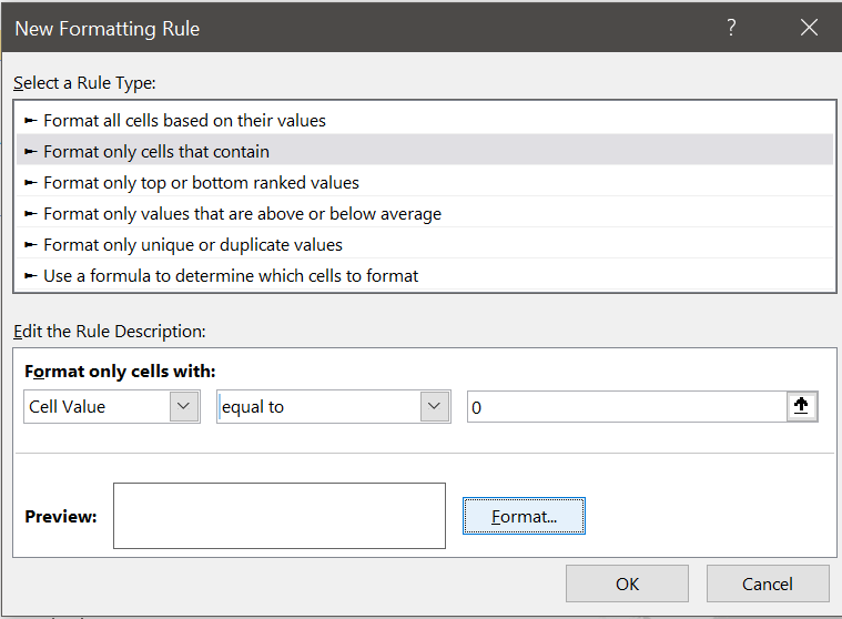
In the New Rule Formatting dialogue, set the rule type to ‘Format only cells that contain’, the cell value is equal to zero and formatting to colour White (fonts same colour with background, thus invisible),
Copy the products table from the Pivot sheet and paste it to cell J3.
Go the process with the regions table again and set profit percentage column, conditional formatting etc.
Now we will add visuals. The visuals are mostly charts and other graphics which visualise the data on data tables such as pivot tables.
We can set the data table on the dashboard and then create the visual over the data table. But the good practice is to create anything that will not be displayed on the dashboard in another sheet.
For that, in our workbook, we have a hidden sheet called Dashboard Tables.
Unhide the sheet Dashboard Tables to view the data backing the visuals on the dashboard.

We will create 4 visuals, and we need to prepare 4 data tables. Create a new sheet for data in your workbook, name it Dashboard Tables;
- Copy the countries table from Pivot sheet to the Dashboard Tables sheet cell B2.
- Copy the customers table from Pivot sheet to the Dashboard Tables sheet cell B15. Set the filter to top 3, we have limited space on the Dashboard.
- Copy the employees table from Pivot sheet to the Dashboard Tables sheet cell B21.
- Copy the countries table from Pivot sheet to the Dashboard Tables sheet cell H2. Remove the filter on this table to display all countries in the table; this will be used for the map visual.
Now we will add our first chart:
Select any cell on the countries table showing the top 10 countries.
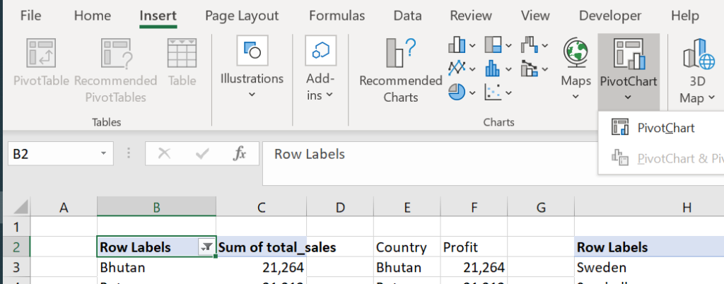
Insert Pivot Chart, Insert > Pivot Chart > Pivot Chart
Select Pie chart.

Cut the chart, go to Dashboard cell D14 and paste.
Right-click on the chart and add data labels.
Change the field settings; format all the field settings to set the borders no border, set the legend position to bottom, pull from the mid-bottom (see red arrow below) to enlarge the chart until row 37.

Set the data labels position to outside and change the font size to 12. Select the percentage on the label options.
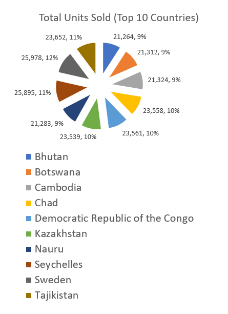
Change the title as Total Units Sold (Top 10 Countries), and set the font to 12.
Right-click on the button on the top left corner and select Hide all field buttons on the chart.
Play with the Pie to give the visual a convenient look.
The countries pie chart is ready.
Now we will add customer and employee charts.
In the dashboard tables, select the customers pivot table and insert the pivot chart Bar.
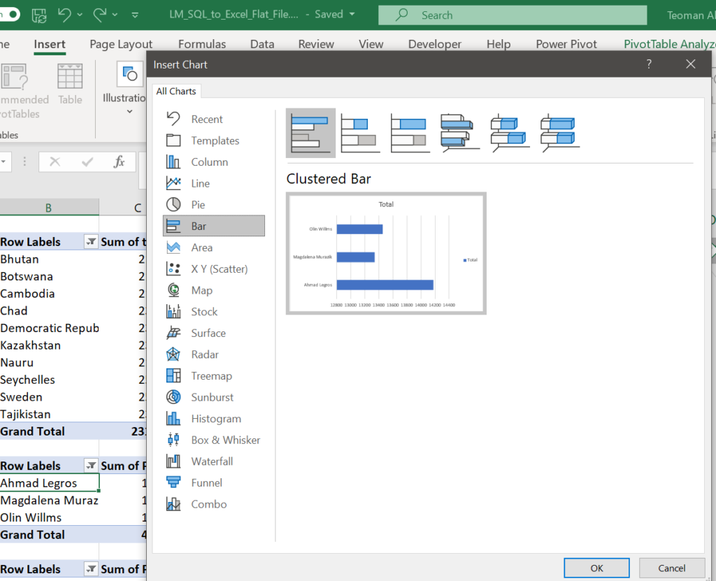
Cut the chart and paste it to Dashboard cell D38.
Do all the edits as the previous table, resize to fit the page.
Do the same process with the employees table, locate it to cell J36 on the Dashboard. You can move the charts by simply dragging them with the Mouse.

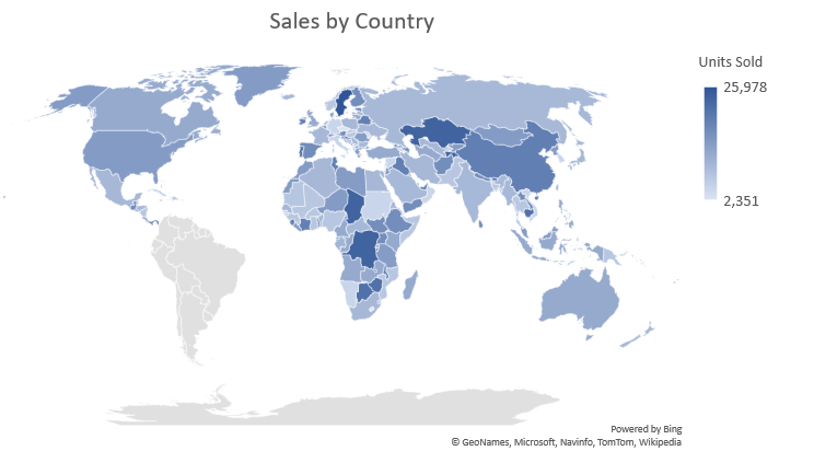
Our final visual is a map. We will show the countries that are trading on a map. As a map by default shows the whole world as an initial display, there is no need to limit our country display by the top 10. For that, we will use a new pivot table for countries with no filters on it. In the pie chart, it was not practical to display more than 10 countries.
A map can not base on pivot tables. So using our new countries pivot table, we will create another data table that is not a pivot table.
On the Dashboard Tables sheet, name the cells M2:N2 as Country and Units Sold (we will display units sold by the country in the map).
Cell M3 =H3
Cell N3 =I3
Copy these 2 formulas down to row 187, till to the end of the country pivot table.
Select any cell on the new countries table and insert the map.
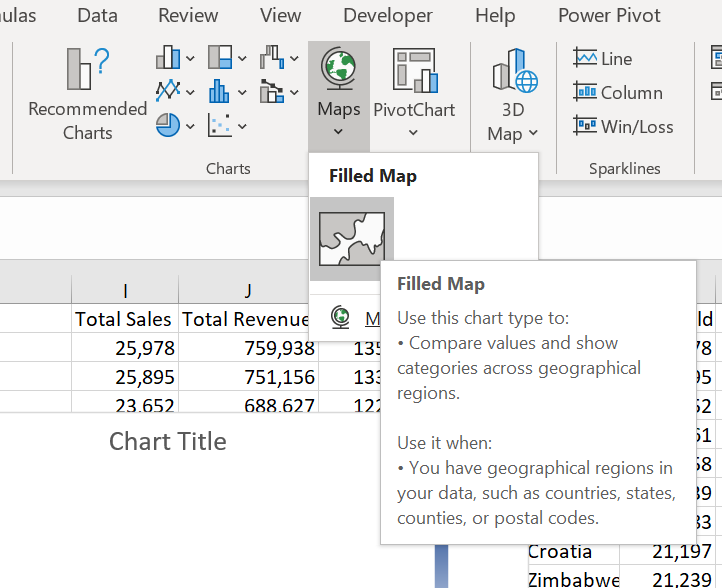
Cut and paste the map to Dashboard cell G15, enlarge it up to cell O35. Remove the borders of the map.
Resize and move the charts and map to get the best view on the Dashboard.
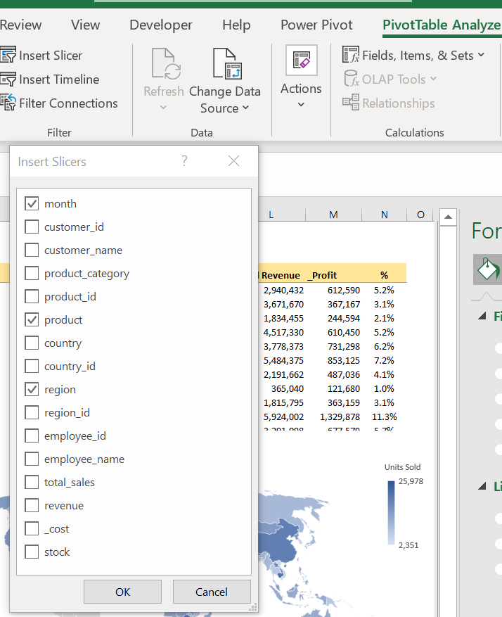
Now it is time to add slicers, one of the most important features of a dashboard. Slicers give depth to the analysis and dynamism to the dashboard.
We will add 3 slicers. PivoTable Analyze > Insert Slicer > select the month, product and region slicers from the dialogue.
Move the region slicer to cell A13, resize it to narrow it until the mid of cell B13.
Select the month slicer, change the layout Format Slicer > Position and Layout > Number of Columns “2”.
Move it immediately near the region slicer, resize it to narrow until all the numbers of the pie chart is visible.
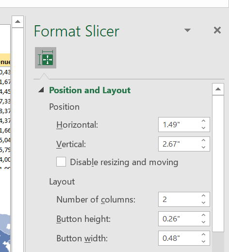
Now set the product slicer to 3 columns, move and fit it below region and month slicers.
Set slicer connections as previously shown, for all slicers to all the tables and charts on the table.
Clear the gridlines of the Dashboard sheet, arrange the layout to landscape and print preview.
Work on cosmetics as you like. Change chart displays, add background, pictures or other visuals.
And finally, put a name on the Dashboard. The red LEAD FINANCE SALES DASHBOARD label is prepared in Microsoft Word.
Play with the slicers as you like for an in-depth analysis.
Next week we will go on with the Power Pivot where we will use all 5 tables of the Lead Merchants database including the 2 million rows order table.